Tesco Homepage Optimisations
Overview
The Tesco.com homepage hadn't changed for many years. A marketing team ran it by swapping banners and links via an old CMS. When my team inherited the homepage, we began with research to inform the redesign.
From Surveys and Focus Groups, Customers told us they expected the homepage to focus on 5 things:
To shop (online or plan in-store)
Browse range and prices.
Extract value (Loyalty)
To contact Tesco
To be inspired.
As design lead, I partnered with the product manager and researcher to create designs based on what users said they wanted (Order again, Top Promos, Features from, Store locator, Clubcard Value, Order Status, Community Initiatives).
We noticed a vast difference between what customers said in surveys and what they did in Lab and Remote Testing. We recalibrated the homepage to serve more as a launchpad to primary missions than as a destination in its own right.
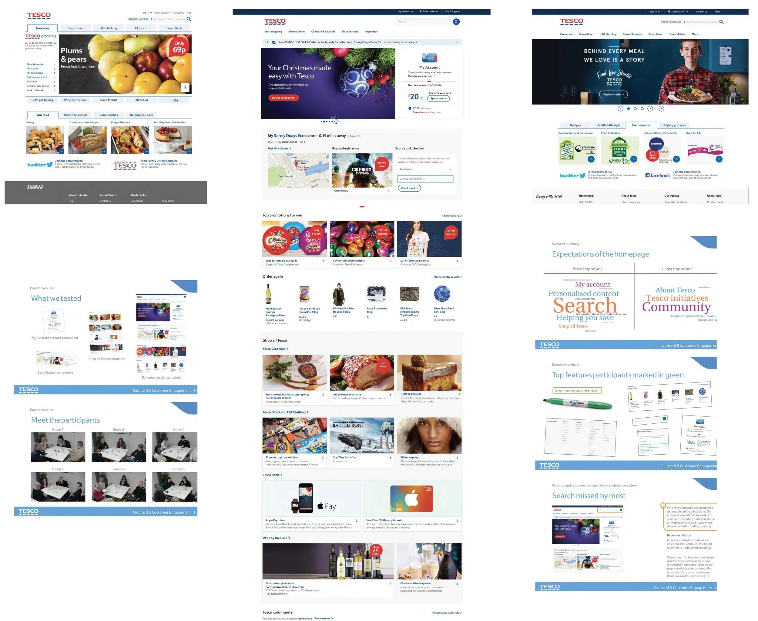
Customer Reactions to Designs:
We invited customers into our Lab to provide feedback on the new designs.
Top 5 designs: My Clubcard Account, Search, Footer, Stock checker, Order again.
Most important features when asked: Search, helping you save, Personalised content, My Account, Shop all Tesco.
Least important features when asked: Community and local events, Tesco initiatives, About Tesco, Inspirational & lifestyle content, Plan my shop (in-store)
Inspirational content wasn’t clearly labelled, and many actively disliked it. Most wanted personalised offers.
The ‘order again’ section contained one-off items which customers would never order again.
The Clubcard section was a big hit. Clear & informative.
Most missed the links in the top nav, as searched.
Conclusion
Focus on a few key things, and simplify and declutter the design. Most participants expected tailored and relevant content. Customers come to the homepage for the reasons we identified, but they also want the experience to feel most relevant to them.