
One Key Evolution:
Aligning Traveller Value with Business Economics
Led the redesign of a $450M+ programme for nearly 100M members, balancing $70M+ in cost savings with traveller trust.
Problem
One Key delivered value on paper, but travellers couldn't clearly see or feel it. The programme was hard to understand; its strongest benefits were too hidden, and flight earn felt disproportionately weak for such a high-value purchase.
The program was delivering financial benefits, but inefficiently. It was expensive, with loyalty costs estimated at $459M in 2025, while 65% of members said they had little to no general understanding of what they were getting. That combination of high cost, low perceived value, and weakening trust pressures both loyalty ROI and long-term competitiveness.
Opportunity
Make loyalty feel valuable in real travel moments, not as a system to decode, but as something members can clearly see, easily understand, and benefit from on every trip through visible savings and stronger trip benefits.
Reinvest loyalty spend into benefits that shape perception and behaviour, making the program more compelling for travellers and more efficient for the business. Part of that came from changing the programme economics: moving away from a flat earn model, introducing tiered earn rates on non-flight bookings, removing low-salience earns like flights, and redirecting that value into clearer savings and stronger, more visible benefits.
The launch scenario was modelled to deliver about $73M in loyalty cost savings while keeping GP roughly flat at $58M, with total modelled savings in the $70–$80M range and total GP impact in the $60–$80M range.
Outcome
BEX 3.0 was the US loyalty redesign that shifted the programme from flat earn to tiered earn, removed flight earn, simplified the structure, and brought benefits like Member Prices, Price Drop Protection, and Flight Delay Access much closer to the surface across shopping, booking, post-booking, Rewards Hub, and the pillar page.
Post-Launch Performance & Tracking
Following the Phase 1 core launch on 28 July 2026 and the Phase 2 "Double Win" release on 30 September 2026, the programme is tracking ahead of financial and behavioural guardrails. The experience changes proved that removing low-salience earn did not degrade traveller retention, while amplifying tangible benefits unlocked stronger engagement among high-value tiers.
Key results post-launch:
Financial guardrails beaten: August Gross Bookings (NBV) tracked at $3.32Bn, running above the upper bound of the modelled flag range ($3.0B–$3.3B), +6.3% vs forecast and +12.3% vs plan.
High-value tiers leading growth: Value concentration in Gold and Platinum delivered immediate returns. Gold was the top-performing tier, driving $531M NBV (+10.0% vs forecast), while Platinum delivered $556M NBV (+7.7% vs forecast). Active Gold membership expanded +9.1% YoY to 2.1M members.
Flight volume remained resilient: Disproving concerns that removing the 0.2% flight earn would trigger churn, Flight NBV held at $1.56Bn (within the $1.5B–$1.7Bn range, +8.3% vs plan). Replacing an invisible fractional earn with flight protection messaging (Price Tracking, Price Drop Protection) protected funnel performance.
Retention held steady through devaluation: Despite resetting Blue base earn from 2% to 1%, the 90-day Brand Repeat Rate held at 37.8% (+1.3 pp YoY), and active members rose to 25.5M (+3.4% YoY). Authentication rates (88.6% App, 32.0% Desktop) and site conversion (4.8%–4.9%) remained stable within normal historical ranges.
Experience operationalisation (Phase 2): On 30 September, the "Double Win" value proposition was rolled out in-product across the Lodging PDP (running as a 50/50 A/B test), App Welcome Screen, Confirmation Page, and a redesigned Rewards Hub featuring simplified progression tracking and a dedicated Lifetime Savings module.
Lets noodle on the details
My Role
Setting the direction
I turned the redesign from a broad loyalty ambition into an execution-ready experience programme. At the start of 2025, I led planning workshops that converted strategy into scoped experience changes, dependencies, and phased sequencing — giving product and engineering the clarity they needed to estimate the work and plan against a tight pre-notification and launch timeline.
Navigating change
I then led the experience through repeated scope shifts, changing priorities, and overlap with adjacent programmes. My role was to keep the traveller story coherent while tightening scope, sequencing must-have work ahead of follow-on improvements, and protecting the value moments that mattered most.
Leading the team and the work
I led a lean team of three designers, with two content designers and researchers supporting in a consultancy capacity, and partnered closely with product and engineering across the pillar page, landing pages, Rewards Hub, messaging hierarchy, pre-notification, and other critical touchpoints. I set the working rhythm through planning workshops, prioritisation sessions, critiques, cross-functional working sessions, and stakeholder playbacks — creating clarity through ambiguity so the redesign could land credibly at scale while still supporting the cost-savings case.
The Challenge
Our loyalty investment is not delivering clear, compelling value for Expedia One Key members today.
Members don't understand what they get
65% of members can't answer basic questions about One Key benefits or how to progress through tiers
Hidden value creates poor program perception
Buried benefits like Price Drop Protection and inconsistent discount language make us seem less competitive than we are
No compelling reason to return to Expedia
Invisible rewards and protections (e.g., flights) make travellers feel they could "book anywhere" for the same value
Simplify
Value should be clear and consistent to travellers, with simple & meaningful tier-based benefits by attributing all Member Prices (& clear badges) to loyalty deals, with value increasing by tier
Amplify
Amplify the perceived value of loyalty benefits by being bolder with member deals & offerings, front and centre in messaging and the traveller experience.
Minify (Costs)
Optimise costs by prioritising key value drivers for top members; remove less incrementality-driving offerings, such as preserving VIPA bonus earn and flight benefits for Gold+, and reduce elsewhere
Approach
Invest in a simpler structure that improves comprehension while optimising loyalty spend.
-
Simplify the experience
Make membership easy to understand at relevant touchpoints
-
Amplify what matters
Highlight rewards and benefits (like MODs and Price Drop Protection)
-
Focus on tier differentiators
Invest in high-value members while showing others how to get there
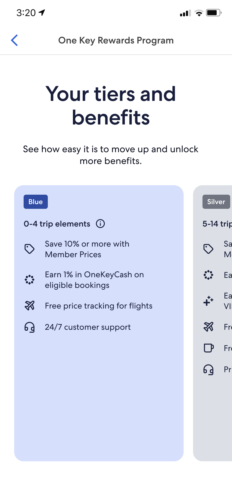
What this means for members
Our loyalty investment is not delivering clear, compelling value for Expedia One Key members today.
Blue and Silver
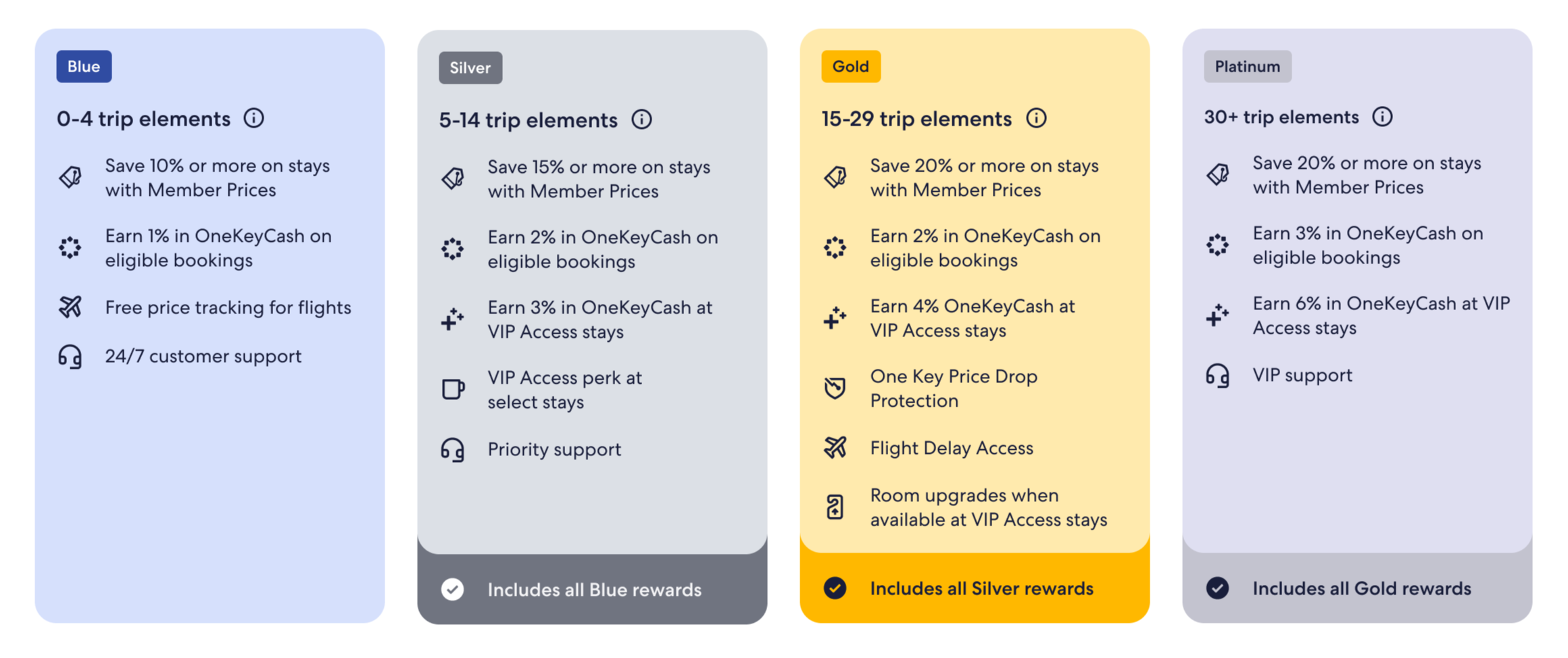
Base earn reset: Blue moved to 1% and Silver to 2% OneKeyCash on eligible non-flight bookings.
Flight earn removed: flights no longer earn OneKeyCash; package earn applies only to the non-flight parts of the trip.
Clearer savings: Blue gets 10%+ off and Silver 15%+ off with Member Prices.
More reason to progress: Silver adds +1% at VIP Access stays plus select in-stay perks like free breakfast.
Experience focus: simpler messaging, stronger visibility of savings and OneKeyCash, and clearer prompts to move up tiers.
Gold and Platinum
Premium tiers strengthened: Gold earns 2% and Platinum 3% OneKeyCash on eligible non-flight bookings.
Higher-value savings: both tiers get 20%+ off with Member Prices.
Richer VIP Access value: Gold gets +2%, and Platinum +4% at VIP Access stays, plus premium in-stay perks.
Flight benefits became differentiators: Price Drop Protection, Flight Delay Access/lounge access, and priority support.
Experience focus: make Gold+ feel clearly more exclusive, protected, and worth aspiring to.
Blue and Silver
Educate and Inspire → Deliver simple messaging that drives engagement and inspires tier progression
Gold and Platinum
Invest and Empower → Amplify exclusive benefits and reinforce the value of being a Gold+ member
Design challenges across the user journey
-
BEX 3.0 notifications were the pre-launch traveller communications for the US loyalty-program changes, designed to give members at least 30 days’ notice before Phase 1 went live.
What they were notifying travellers about:
the move from flat 2% earn to tiered earn
the removal of flight earn
broader One Key / BEX 3.0 program changes
the sunsetting of Hotel Price Guarantee (HPG) and related eligibility restrictions during transition.
Where the notifications appeared:
email notifications
onsite banners on BEX, HCOM, and Vrbo pillar pages
BEX T&Cs
Help Center articles
a separate notification landing page
a dedicated HPG banner on the Hotel Price Guarantee page.
Email notifications targeted US users with loyalty activity in the last 18 months across Expedia, HCOM, and Vrbo.
-
Scope at launch: narrowed to two targeted changes:
A clearer explanation of how reward currency works
A new educational module for Blue-tier members who had earned rewards but never redeemed them.
Also updated: static earn messaging, so the experience reflected the new earn model and the removal of flight earn.
How the scope shifted: it started as a broader benefit-amplification opportunity, but was cut back for launch. Broader follow-on work — refreshed FAQs, tighter terminology, and a fuller value story — moved to later phases and depended on design and engineering sizing.
What “Double Win” meant: showing two types of value together:
Money saved on the current booking
Rewards earned for a future trip.
The aim was to make loyalty feel immediate and tangible: save now, earn for later.
Design challenge: help lower-engagement members understand rewards without turning the page into dense explainer copy. A richer, more contextual UI was discussed, but the launch version stayed intentionally lightweight; copy also had to stay legally precise in limited space.
-
Scope of work: a broader redesign of the main loyalty landing page to make the program easier to understand, more visual, and more motivating.
What it needed to do:
Explain the move to tiered earning
Make clear that flights no longer earn rewards
Make progression, benefits, and value easier to grasp at a glance.
Original ambition: a more tailored experience by member state and tier, with distinct journeys for guest, Blue, Silver, Gold, and Platinum members.
How the scope shifted: that ambition had to be phased. More advanced tier and benefit treatments were moved to fast-follow or later phases, while the launch version kept a simpler benefits-by-tier approach, so the first release remained realistic within the delivery window and engineering capacity.
Design + engineering collaboration: the teams worked closely to define a realistic first release. New ideas were explored together, but richer concepts — such as more progressive tier-card treatments and other refinements — were deliberately deferred to later phases.
Design challenge: explain a more complex loyalty model in a way that felt lighter, less cluttered, and easier to scan, while still keeping important rules and disclaimers accurate.
-
What changed: improvements across the Expedia hotel path — search results, property detail, checkout, and confirmation — to make loyalty value clearer and more consistent for signed-in members.
What was included: clearer member-price savings, easier-to-understand reward earning and tier progress, and a reusable loyalty summary across detail, checkout, and confirmation.
What stayed lighter-weight: search-results changes focused more on cleaner value cues and badge hygiene than on showing full reward math.
What stayed out of scope: work was limited to hotels only, excluding flights, packages, premium-stay programs, and non-US markets.
Main design challenge: explain current benefits, future-tier progression, and expected rewards in a way that felt simple and credible across multiple surfaces.
Why some work moved: parts of the in-path hotel work overlapped with the family travel quick-wins program, so some epics were paused, closed, or handed to adjacent teams.
-
What changed: a focused refresh of the Expedia flights shopping experience to simplify the path to purchase and make loyalty benefits easier to understand.
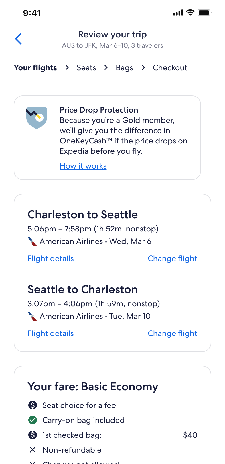
What was included: search simplification, persistent filters, cleaner fare cards, clearer Price Drop Protection messaging, continued Price Tracking visibility, and better seat-selection support for families.
How loyalty showed up: as reward earning on flights was removed, value shifted toward benefits like Price Tracking, Price Drop Protection, and Flight Delay Access.
What stayed out of scope: launch was limited to standalone flights; packages were split into separate scope and ownership.
Main design challenge: add benefit clarity without interrupting conversion or turning the funnel into a loyalty explainer.
Why some work moved: ownership was split across flights, loyalty, packages, and insurance-related teams, so some work was partnered, deferred, or dropped.

Meet Sarah, a Blue member…
Blue is Expedia US One Key’s entry tier: a traveller qualifies simply by creating an account, with 0 trip elements required.
Blue is the program's scale tier and makes up the largest part of Expedia's active member base.
Qualification: account holder; 0 trip elements required.
Size: 16.7M active Expedia travellers in the 12-month active base shown, or roughly 52% of the total active base shown including non-members, and about 65% of members excluding non-members.
Value per traveller: about $1,900 average market GBV.
Share of wallet: about 34%, versus 35% for non-members.
Business value: Blue drives scale, but relatively modest incremental value versus higher tiers; the long-term returns view shows about +$8 cumulative GP per traveller / 1.2x vs non-member.
Meet Sarah, a Blue member
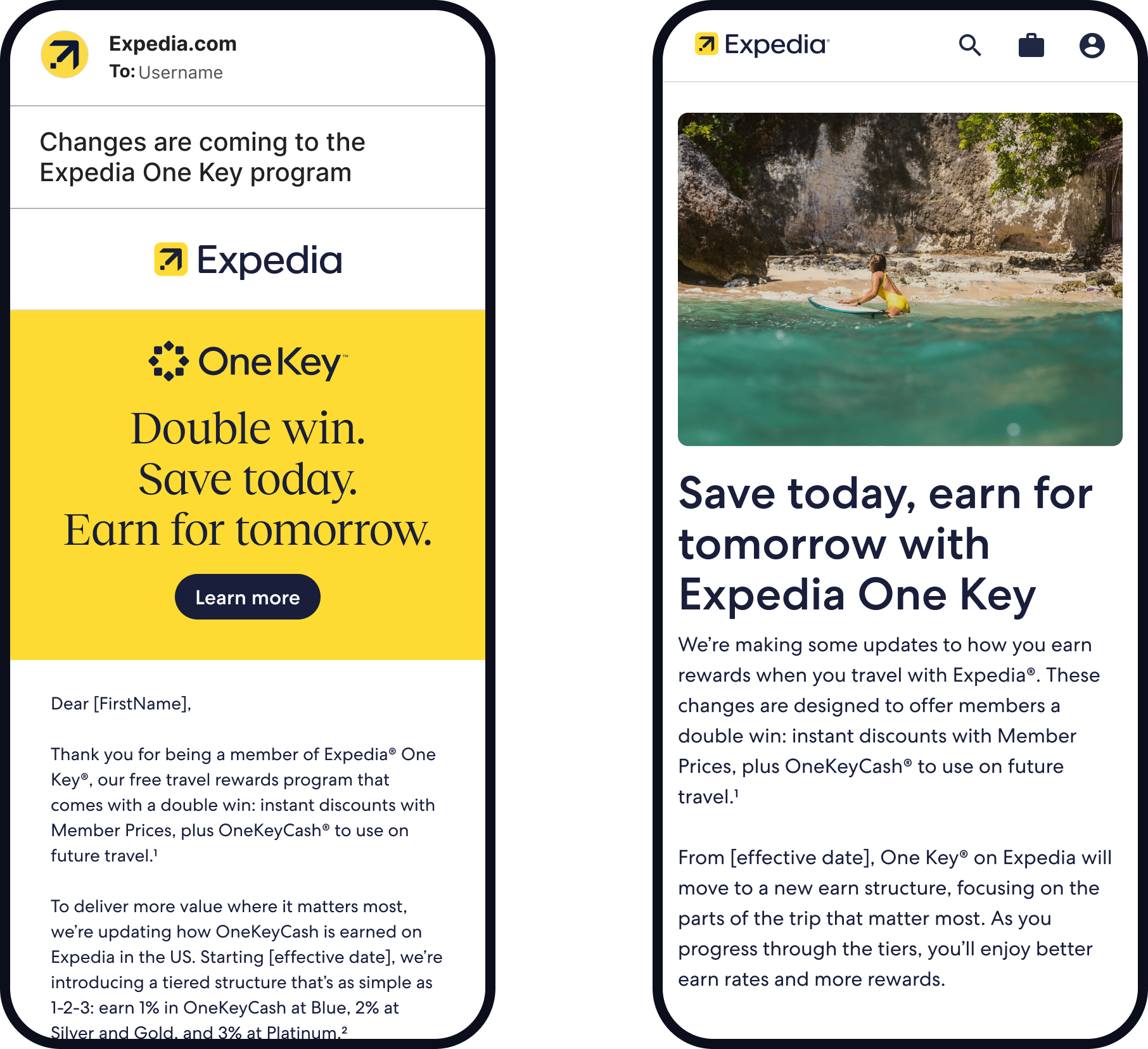
She receives an email telling her what's changing
😊 Travellers are alerted to changes with email and banners (pillar page, help centre, T&Cs) 30 days before changes take effect
Focus areas:
Legal compliance
Focus on tier differentiators
Email and Landing Page
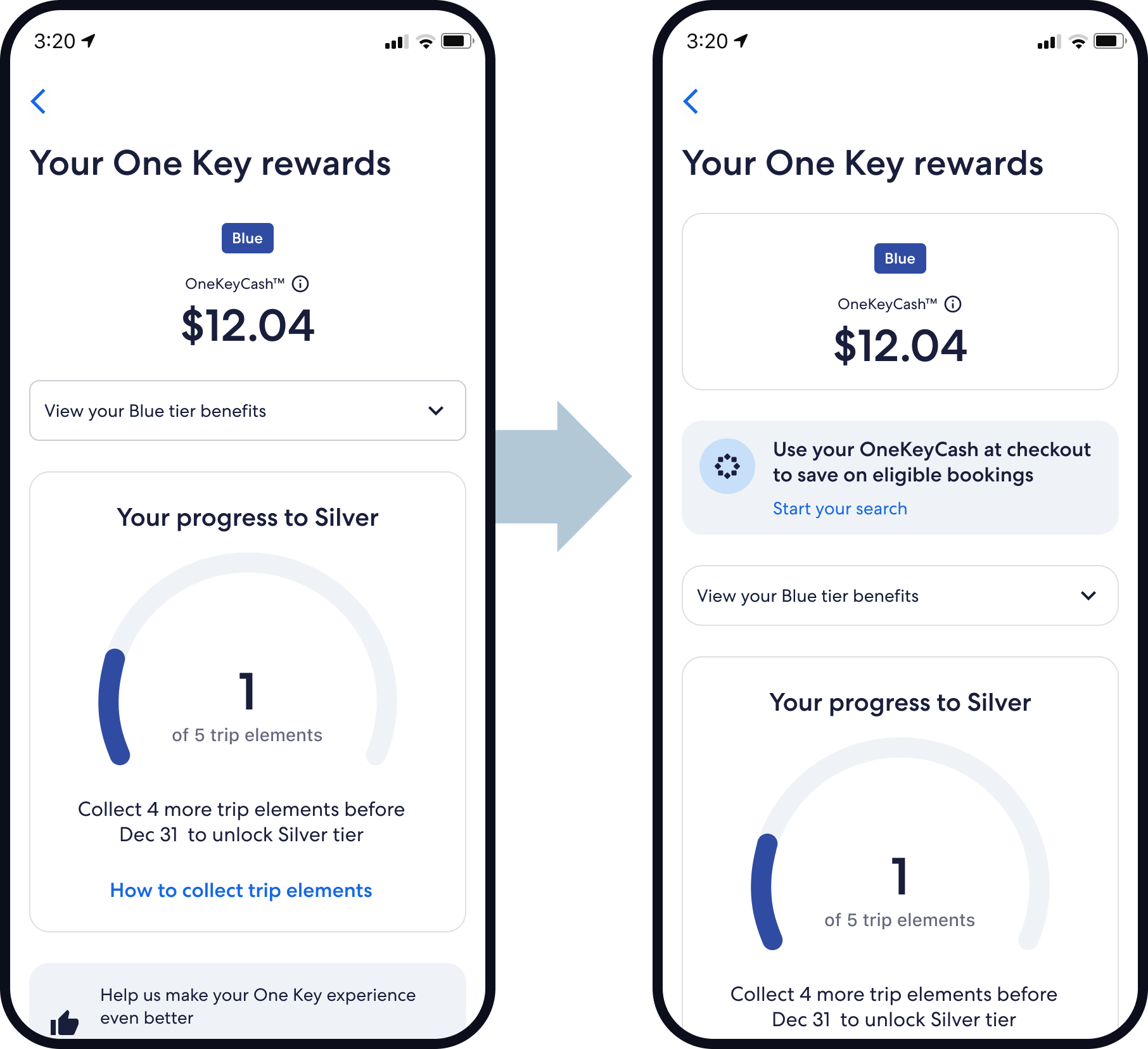
Sarah returns to check her rewards
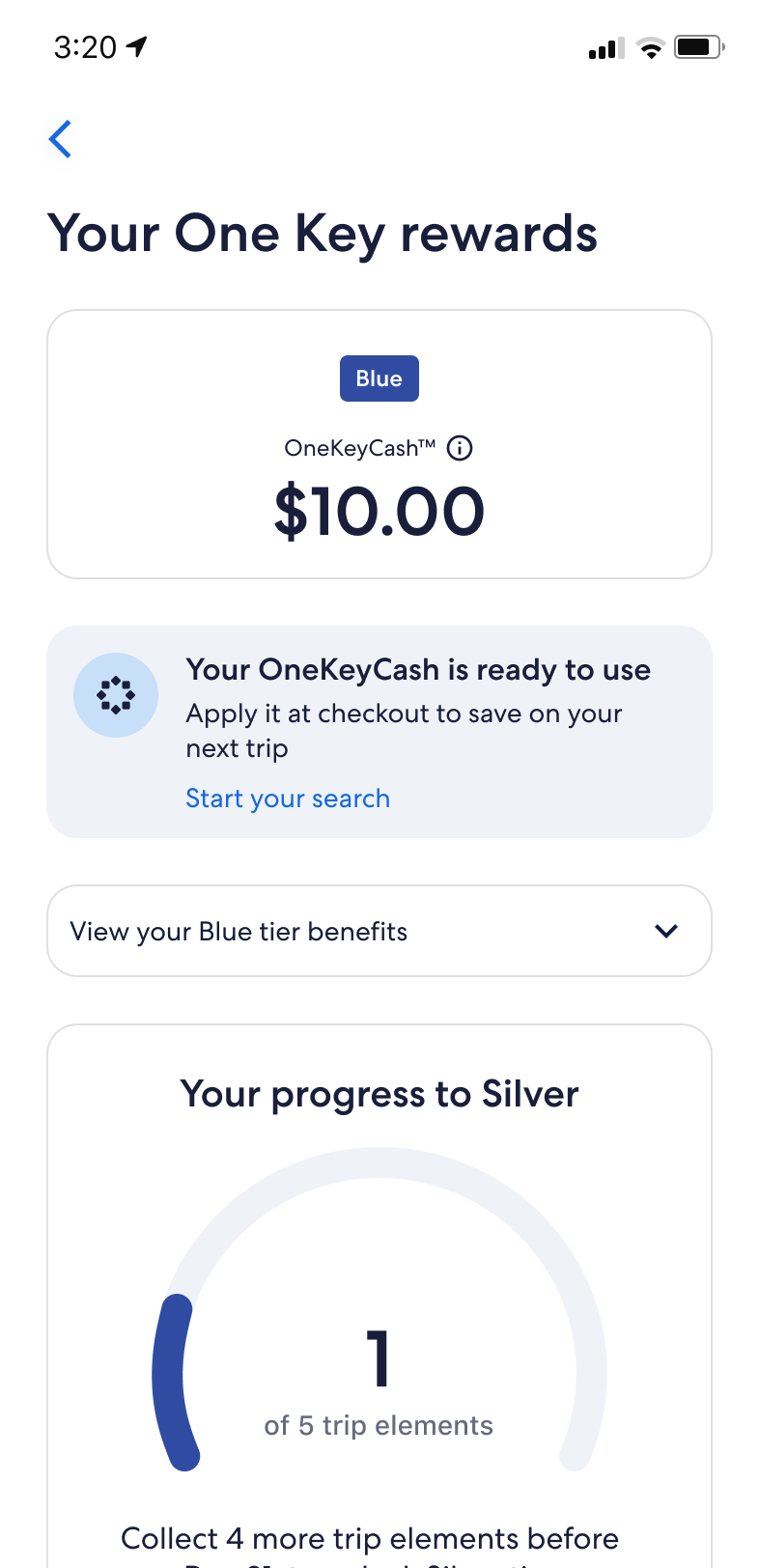
She discovers that she has $12 in OneKeyCash
☹️ 4 out of 5 Blue members have OKC but don't redeem it
😊 Educational prompt shows travellers how to redeem OKC and sets the foundation for future enhancements
Focus areas:
Simplify the experience
Amplify what matters
Before / After
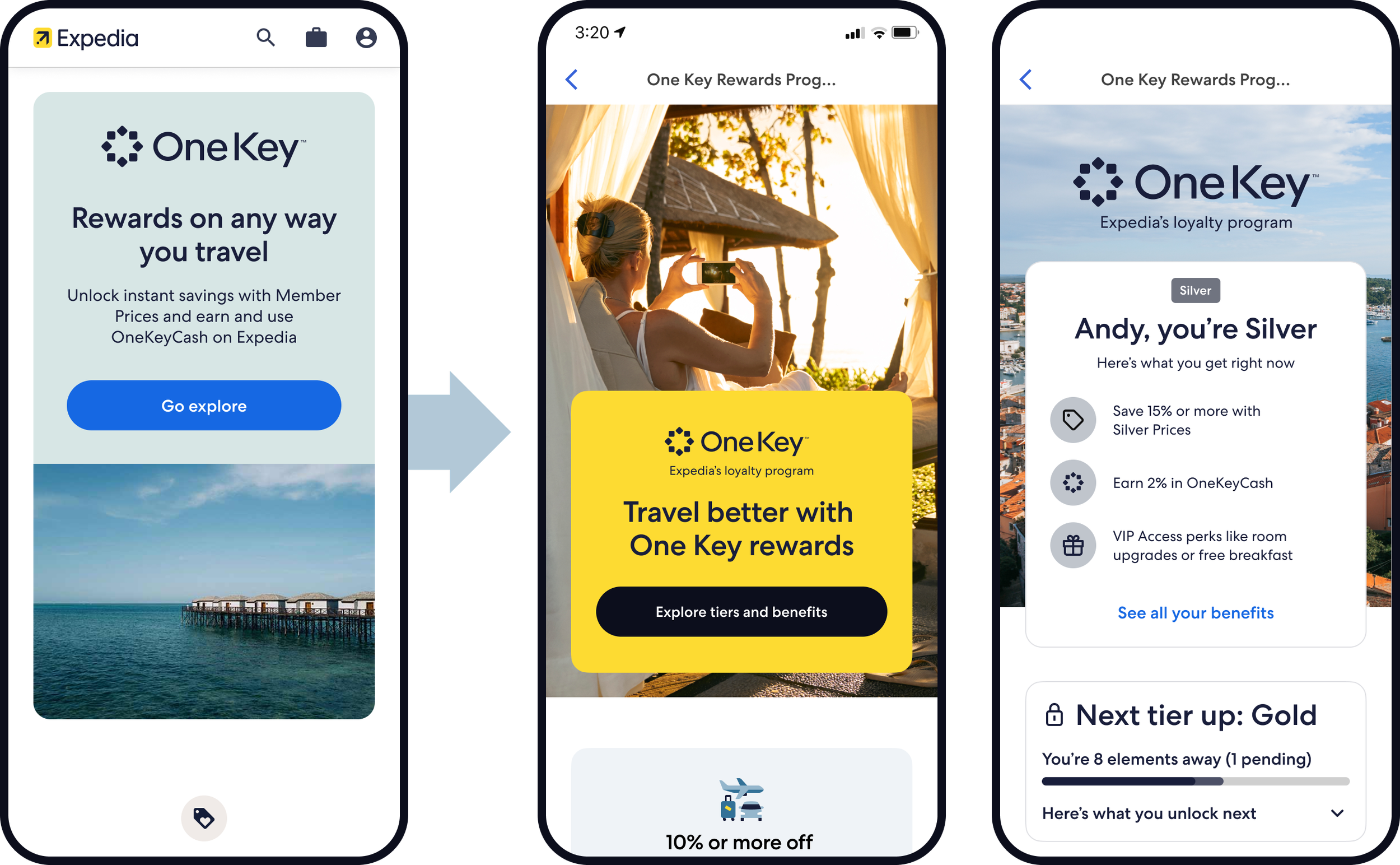
Sarah decides to learn more
Finally, she understands what she gets
☹️ Generic page with buried benefits
☹️ 3x longer than the longest competitor
😊 Reduced page height by 70%
😊 Personalised view by tier
Focus areas:
Legal compliance
Simplify the experience
Amplify what matters
Focus on tier differentiators
Before / After
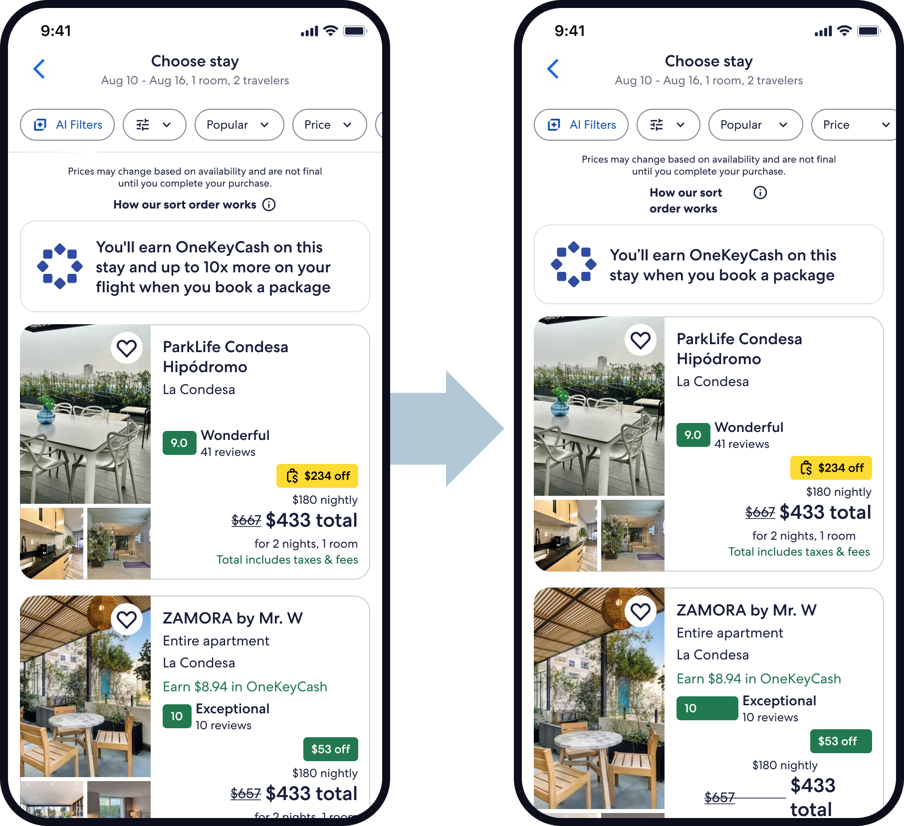
Sarah searches for her next trip
While shopping, she notices member benefits
😊 Replaced flight-related earn messaging
Focus areas:
Simplify the experience
Before / After

Now meet Mark, a Gold member…
Gold is Expedia US’s first clearly high-value tier: a traveller qualifies at 15 trip elements in a calendar year, and Gold members sit well above Blue on spend, share of wallet, and long-term contribution.
This is where loyalty starts to become materially more valuable for the business.
Qualification: 15 trip elements in the calendar year.
Size: 1.8M active Expedia travelers in the 12-month active base shown, or roughly 5.6% of the total active base shown including non-members, and about 7% of members excluding non-members.
Value per traveler: about $3,700 average market GBV.
Share of wallet: about 46%, which is +11 points vs non-members.
Business value: Gold members generate much stronger long-term returns, with about +$199 cumulative GP per traveler / 4.5x vs non-member.
Strategic value: loyalty investment has its highest impact among Gold and Platinum, and Gold members are more likely to shop across brands: 17% of Gold members book cross-brand, versus 5% of Blue members and 2% of non-members.
Now meet Mark, a Gold member
He is looking for a flight for his next trip
☹️ Inconsistent messaging and branding for loyalty perks
☹️ Redundant placements add cognitive load and noise
😊 Eliminated redundant placements and earn messaging in flights path
😊 Standardised Price Drop Protection branding and language
Focus areas:
Legal compliance
Simplify the experience
Amplify what matters
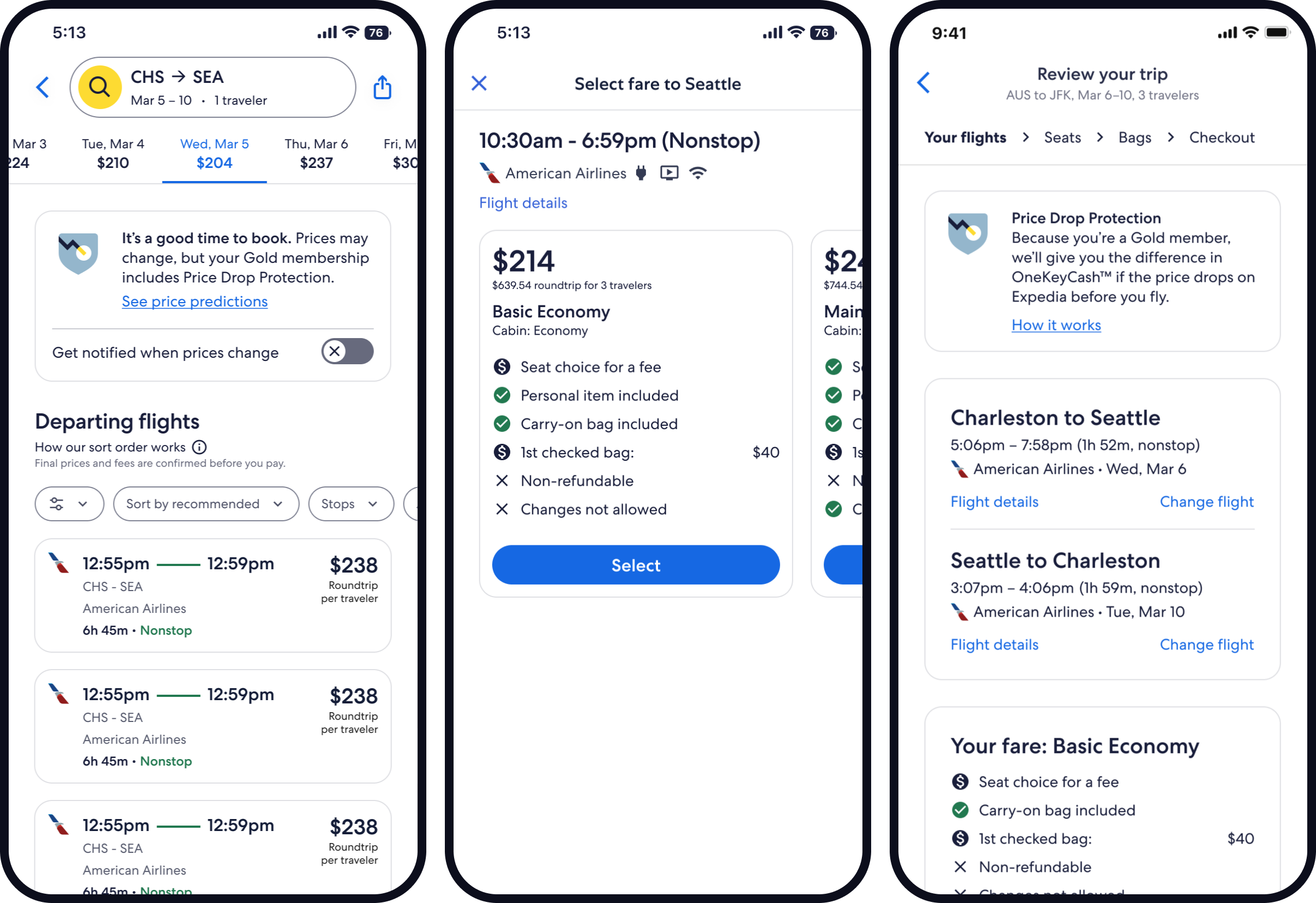
Before
After
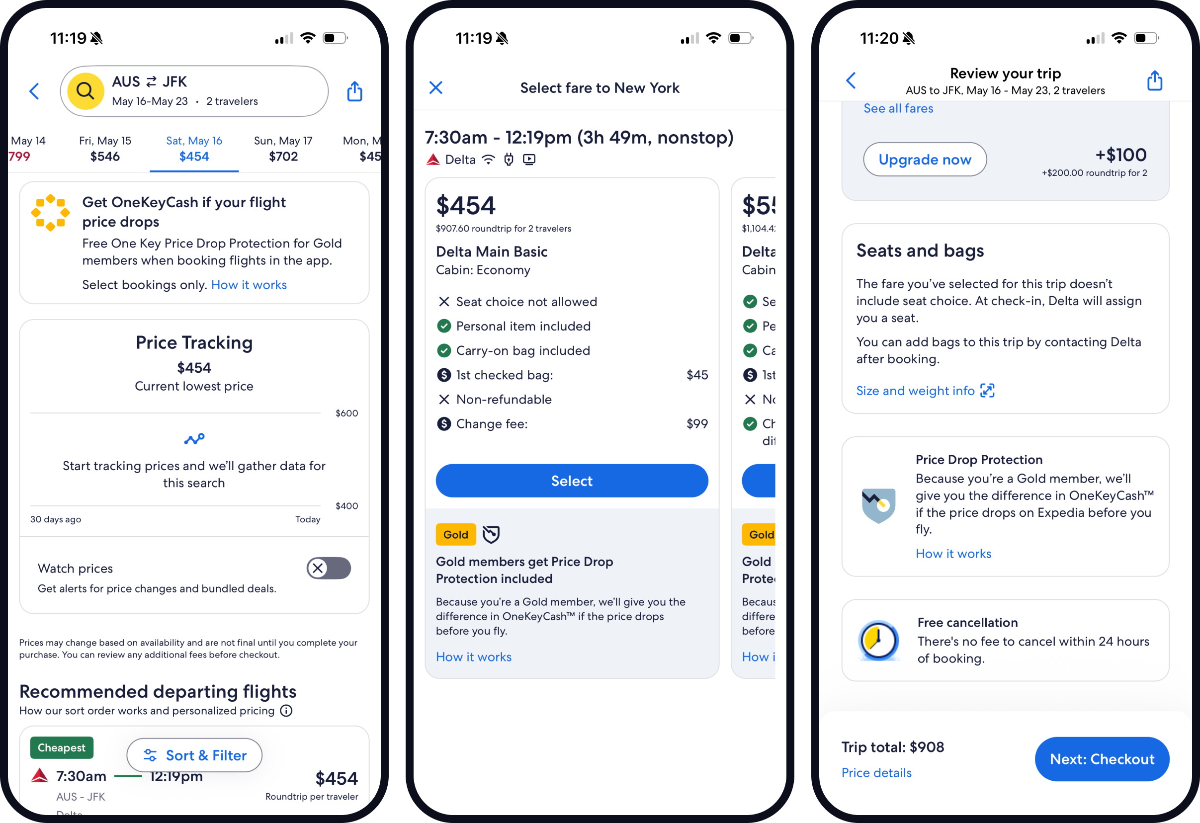
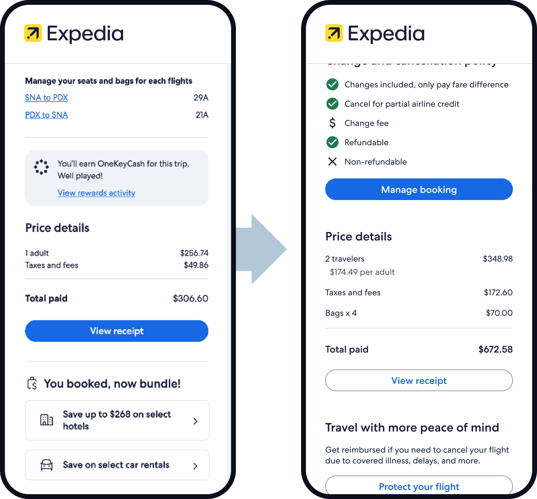
He gets an email after booking
Where he can see confirmation details
☹️ Banner highlighting flight earn
😊 Removal of flight earn banner (target 24 June by UMP)
Focus areas:
Legal compliance
Focus on tier differentiators
Sumamry
One Key was financially valuable, but too little of that value reached travellers. In 2025, the programme carried an estimated $459M in loyalty costs, while 65% of members said they understood little to nothing about what they were getting. On flights, one of the biggest and most frequent travel purchases, members earned just 0.2% back — a mechanic that felt weak, confusing, and unfair.
What changed for travellers
The One Key loyalty redesign rebalanced the programme from low-salience earn to value travellers could more clearly see and feel. It moved Expedia US from a flat 2% earn model to tiered earn of 1% / 2% / 2% / 3% for Blue / Silver / Gold / Platinum on eligible non-flight bookings, removed flight earn entirely, and redirected value toward more visible benefits like Member Prices, Price Drop Protection, Flight Delay Access, clearer tier differentiation, and easier redemption.
What it delivered
This was a large-scale loyalty reset for a base of 98.6M active One Key members. The launch scenario was modelled to deliver about $73M in contra revenue savings while keeping GP roughly flat at $58M, with broader programme modelling showing $70–$80M total savings and $60–$80M GP impact in steady state. The work also aimed to improve active member growth and tier progression while making loyalty spend more efficient.
This was not just a proposition change. The work spanned pre-notification, landing pages, shopping, booking, post-booking, Rewards Hub, pillar page, redemption prompts, FAQs, and transactional communications — shifting the value story from something members had to decode into something that was more visible across the full journey.
What research told us
Research and review work showed a consistent comprehension and value-perception problem: members often struggled to explain what One Key actually gave them, hidden benefits weakened perceived competitiveness, and too much of the programme’s value was invisible rather than felt. The redesign responded by simplifying the structure and surfacing value in moments when travellers were more likely to notice and use it.
How it landed externally
The Points Guy (thepointsguy.com) viewed the changes as a clear redistribution of value rather than a universal uplift. Their review suggested Platinum members came out strongest, Gold members gained more tangible travel protections, while Blue members and flight-first travellers saw less value because flight earn disappeared and base earn became less generous. In other words, the external read broadly matched the strategy: less low-felt earn, more visible and differentiated benefits.
Our CEO, Ariane Gorin, emailed, “What a great job in making something that could be a legal notice into something that is customer-focused...and not all teams can say that! Great work, team!!”
The redesign shifted One Key from being value-heavy but poorly perceived to being simpler, more visible, and more cost-efficient. It reduced inefficient loyalty spend, made the tier story more concrete, and brought benefits travellers were more likely to notice closer to the surface, all at the scale of nearly 100M active members.
Translating perks into proof (October 2026 Consumer Campaign)
To build on the earned-media coverage from launch, BEX launched a creator-led social campaign in October across TikTok, Instagram, and YouTube Shorts. The campaign focused on "Decoding One Key: Turning Perks into Proof," demonstrating the UX improvements and benefit visibility in real-world travel scenarios:
Price Drop Protection in action: Travel creator Kevin Droniak (1.3M+ followers) documented an extreme 24-hour day trip to Santiago, Chile, showing Platinum members how Price Drop Protection automatically works in-app and returns cash rewards for future travel.
Airport day-of-travel confidence: Brett Conti (1.4M+ followers) highlighted the travel-day differentiator of Flight Delay Lounge Access alongside CLEAR+ integration, showing Gold and Platinum members how the app removes stress during flight disruptions.
The "Double Win" narrative: Dani and Nico (@twooutsiders, 1.4M+ followers) showcased real-trip booking receipts to unpack the core proposition—saving money instantly via Member Prices while earning OneKeyCash for future bookings.
Operationalising traveler-first language
Externally, we also shifted the language away from internal acronyms to plain-language, benefit-first terminology:
"Flight Delay Access" was renamed in customer-facing touchpoints to "Free lounge pass for delayed flights" or "Flight Delay Lounge Access."
The benefit was framed clearly as a multi-year pilot (valid through 12/31/27) to maintain legal clarity and manage expectations, while the design team progressed dedicated landing-page optimisations (streamlined retrieval and parity between lounge passes and OneKeyCash conversion) to improve on the historical 4.9% redemption rate.
thepointsguy.com review
Appendix
Pillar Page Designs
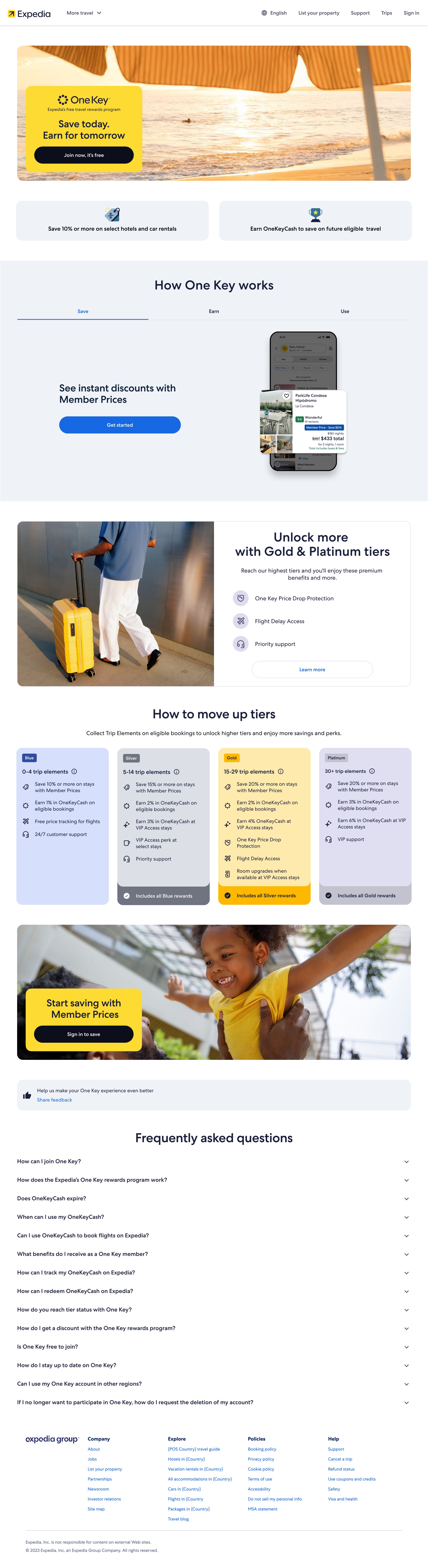
Redesign of the main loyalty landing page to convey program changes relevant to loyalty tier/status that make the program easier to understand, more visual, and more motivating.
Before
After
Rewards Hub scope shift
The original Rewards Hub scope was broad: better surface the value members already had access to, whether through OneKeyCash, benefits, or both. The aim was to make rewards more visible and usable for members, especially by showing benefits more clearly and explaining how OneKeyCash worked.
The revised scope became much narrower and more action-oriented. Instead of improving Rewards Hub for all members, it focused on Blue members with more than $1 in OneKeyCash who had never redeemed before. The insight was that most One Key members are Blue tier, many hold only $5-$20 in OneKeyCash, and engagement with burn entry points increases once balances are above $10 — yet many still do not complete a first redemption because they do not understand how OneKeyCash works or what it is worth.
The opportunity was significant: 81.9% of Blue members had never burned OneKeyCash, despite holding an average earned balance of $15.61. In practice, roughly 4 in 5 Blue members had small but meaningful balances they never used.
That shifted the design challenge from broad value communication to targeted activation: identify Blue members with unused balance, explain in simple terms how OneKeyCash works, and guide them into a booking flow where they are most likely to complete a first burn. Success was no longer general understanding, but reducing the share of Blue members who had never redeemed and increasing first-ever redemptions.
Revised Scope
Previous Scope
Flight Delay Access
The focus for Flight Delay Access was less about inventing a new benefit than making an underused one feel real, visible, and premium. The intent was to move it from a limited pilot into a clearly understood Gold-and-above benefit, positioned alongside other high-value flight protections rather than buried in fine print. The usage data reinforced that need: since launch, 165.9k lounge passes had been issued, but only 8.1k were redeemed — a redemption rate of just 4.9%. Benchmarking also showed Expedia performing well below a ~20% pass-redemption benchmark, with most utilisation coming through OneKeyCash instead of lounge-pass use.
That created a more specific design challenge than simple benefit awareness. Members needed to understand who qualified, when the benefit applied, and what they were actually entitled to during a disruption. The experience work therefore focused on better discoverability, clearer rules, more obvious reminders, and practical access cues such as QR-based entry, while also aligning around a launch threshold of 90+ minute delays.
In practice, this made Flight Delay Access part of a broader premium-travel story for higher tiers: not just “earn more,” but “travel with more protection and support when things go wrong.” The design focused on making that value clear before, during, and after booking, so the benefit felt like a meaningful reason to move into higher tiers rather than an obscure perk members might never notice.
User Profile / Account
Rewards Hub
Homepage
Testimonials
Working with Carl on Loyalty experiences at Expedia.


