
Onboarding Experiences
Leading the shift from one-off welcome screens to contextual onboarding, connecting app discovery, membership and personalisation across Expedia Group brands.
Opportunity
Onboarding was a one-off welcome sequence that many travellers skipped. We saw an opportunity to showcase the app’s value, clarify member benefits, and help travellers discover useful features at the right moment. Our goals were to increase sign-ins and account creation, encourage return visits and support booking, without getting in the way of what travellers came to do.
Approach
Over eight months, I led two product designers and a content designer in a distributed, multidisciplinary team with Research, Product and Engineering. We tested improvements on live traffic, developed contextual onboarding patterns, and worked with teams across loyalty, identity, and personalisation to decide what to show, to whom, and when.
Outcomes
The work improved onboarding progression and authentication, informed rollouts across Expedia Group brands and gave teams shared guidance for future experiences. We left a framework grounded in traveller needs, research and test findings, with priorities defined for the team taking the work forward when I moved to Homepage.
Let’s noodle on the details
Overview
Onboarding in the Expedia app sets expectations and shows value early. Done right, it introduces key features and loyalty benefits without getting in the way of why people opened the app in the first place: searching and booking travel.
When I took over design leadership for Onboarding, the experience was treated as a standalone, one-off sequence of screens. My team re-architected it into a connected set of patterns across the traveller journey and user states. As other product teams saw the impact on sign-ins and engagement, demand to get their features into the onboarding flow grew rapidly. We introduced clear pattern governance, content standards, and an intake process to manage that demand. Once Onboarding operated with clear governance and was integrated into broader member growth programs, leadership asked me to take on Homepage. It was another critical surface that had historically lacked dedicated direction and ownership, and my remit was to bring the same clarity, structure, and momentum we'd established in Onboarding.
Team & Leadership
As Senior Design Manager, I led design strategy and execution across a multidisciplinary team:
2 Product Designers
1 Content Designer
1 UX Researcher
2 Product Managers
8 Engineers
We ran iterative tests on live traffic, defined design system patterns for in-app guidance across Expedia Group brands, and expanded onboarding from a first-launch splash into contextual touchpoints.
The Problem
When travellers opened the Expedia app, nearly half bypassed sign-in:
51% Signed in
4.6% Signed up
44% Skipped sign-in entirely
Skipping sign-in meant 44% of our audience landed in the app anonymously, in a generic state. That had a direct downstream impact: users missed out on member pricing and OneKeyCash earnings, while Adaptive Home had no profile data to personalise recommendations or recent searches.
The Opportunity
Show clear, immediate member benefits during the initial launch flow to give new and returning travellers a reason to sign in or create an account, rather than skipping straight to search.
Historical Context
Previous tests across Expedia Group brands proved that targeted onboarding could move the needle on account creation:
Brand Expedia (2022): +45% sign-ups
Hotels.com (2022): +50% sign-ups
Hotels.com (2017): +68% sign-ups, +4.8% conversion (CVR)
Hotwire (2021): +3.37% conversion (CVR)
Approach
Vision and Focus
Create an end-to-end, contextualised onboarding experience that empowers and excites the traveller while gathering information to enable a personalised experience.
Strategy & Execution
Shift from Feature Tours to Immediate Value
Moving beyond multi-screen carousels: iOS experiment data showed that 80% of users skipped traditional multi-screen carousels immediately, with only 13% ever reaching the third screen.
Prioritising tangible member rewards: We shifted to a focused, single-screen experience highlighting clear value propositions (member pricing, OneKeyCash, price tracking). This drove a +6% lift in identification rate and created a much cleaner handoff into sign-in.
Contextual Guidance Over Static Screens
Intent-driven timing: Rather than front-loading information on first launch, we introduced progressive guidance tied to traveller intent signals and journey milestones.
Clear guidance standards: As demand for in-app guidance grew across partner teams, we established shared principles to ensure nudges remained contextual, dismissible, and focused on traveller tasks rather than compensating for UI complexity.
What We Measured
Account Creation (Membership) & Identity
The App Onboarding carousel screens are a proven way to drive Sign-ups.
Identification Rate (IDR) / Authentication Rate
Net new sign-ups
Sign-in completion rate
App Retention & Booking Behaviour
Highlighting key benefits and core offerings to reinforce the app’s value.
7-day return visitor rate (7-day RVR)
Search-to-booking conversion rate (CVR)
Onboarding screen completion rate
Engagement with highlighted tools (e.g. Trips, Price Tracking)
When everything is important…
We made the case for more contextual onboarding, responding to who the traveller was, what they needed, and when they arrived, rather than showing everyone the same messages. That meant building a broader set of content for the experience to draw from.
We reached out to teams whose work could be relevant, while other teams and leaders brought us their own ideas and priorities. Together, we shaped those opportunities and set clearer guidelines for what to show, to whom and when. The challenge was balancing business priorities with what a traveller would expect or find useful in that moment.
Price Tracking & Predictions
Price Drop Protection
Loyalty Rewards / One key
Conversational Shopping
Signal gathering for Personalisation
Preference Centre
Trip-boards
Adaptive Home / Recommendations
Accessibility
Member Onboarding
Showcasing New Apps Features & Functionality
Marketing Campaigns/Requests
Solving for traveller pain points
Onboarding Should
Make a great first impression on travellers
Give travellers a reason to keep the app
Get the traveller excited about new features
Meet travellers where they are in their trip journey
Enable a personalised app experience

Onboarding should not
Prevent the traveller from achieving the goal they have in mind
Be irrelevant to the traveller's needs
Collect data without explaining how it will be used
Collect data that travellers can’t edit or manage later




Onboarding Themes
Opportunities and Insights informed 3 types of Onboarding experiences (themes) that shaped the purpose and approach to Onboarding.
Excite the Traveller
Inspire travellers with new features and functionality
Educate travellers about relevant value prop benefits
Motivate travellers with immediate Rewards, Savings & Value
Support a lasting first impression
Provide travellers with a reason to come back
Know the Traveller
Capture data to provide a more personalised onward journey
Leverage signals to surface relevant onboarding experiences
Encourage sign-in/sign-up
Empower the Traveller
Help the traveller complete the goal they have in mind / their current job to be done
Encourage the traveller to get started with some first actions
Manage preferences such as notification opt-in
What informed our onboarding work
We drew on research across Expedia, Hotels.com and Vrbo to help the team define and refine our onboarding direction. We brought this together with behavioural data, competitive examples and technical discovery.
-
Research showed that practical benefits resonated more than broad membership promises. We focused on making the immediate value to travellers clearer. [Sign-in Sign-up Value Prop Study Report]
N. Rossi’s baseline study showed that travellers skimmed the screens, wanted clearer app-specific benefits and struggled to judge the value of reward points. This reinforced our focus on concise, concrete messaging. [Onboarding Baseline Study]
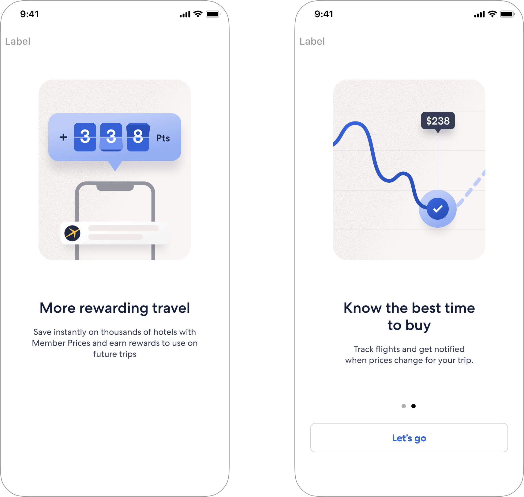
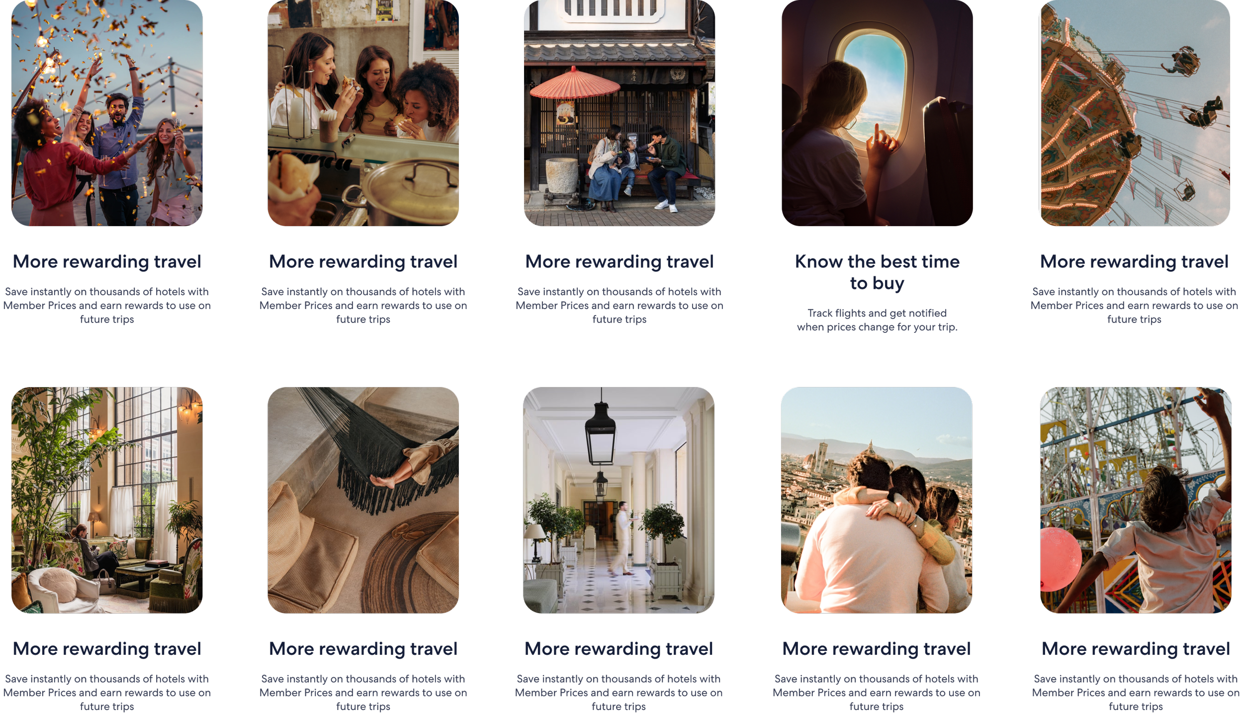
Her imagery study showed that the tested illustrations explained rewards and price tracking more clearly than the proposed photos. We used this to inform how images and headlines worked together, balancing travel inspiration with a clear explanation of the benefit. [Onboarding Value Proposition Image Research]
-
New app downloads included existing customers. We explored how the introduction could reflect what we already knew about someone. [New_App_User_Behaviour]
Travellers expected signed-in experiences and recommendations to reflect their trips, searches and answers. This shaped our thinking about giving people a visible benefit from sharing information. [2020-11 IDR findings report; Reimagine Understanding Foundational]
Generic inspiration was often bypassed, while content based on recent searches felt more relevant. This reinforced our focus on the traveller’s current intent. [Home concepting findings, attachment 11]
-
Travellers often wanted to try the app before creating an account, and some in the baseline study missed the option to bypass sign-up. This informed our thinking about when to ask people to sign in and how clearly we showed they could continue without doing so. [Sign-in Research; 00302 App Onboarding - Report; Onboarding Baseline Study]
An earlier experiment showed that changing the order of loyalty and notification requests reduced push opt-in. It reminded us to question and test the request sequence. [iOS Swap order of onboarding screens summary]
-
Travellers wanted to move at their own pace and skip onboarding. High skipping and improved completion with clearer navigation encouraged simpler introductions and more obvious next steps. [00302 App Onboarding - Report; Onboarding_Test_MayExplore; Onboarding_Iteration 2_InitialResults]
Common login appealed as a way to reduce repeated entry, but travellers still wanted choice and reassurance about data sharing. [Expedia Common Login Report Final]
-
Travellers skimmed screens and focused on images and headlines. This informed our visual hierarchy: the main message needed to be clear without relying on small supporting copy. [Onboarding Baseline Study; Onboarding Value Proposition Image Research]
Vague rewards language left people questioning the value. We focused our content on concrete benefits, what points meant and why using the app was worthwhile. [Onboarding Baseline Study; Sign-in Sign-up Value Prop Study Report]
The tested illustrations communicated rewards and price tracking more clearly than the proposed photos, although they could feel cold or confusing. This helped us balance clear explanation with a more inviting visual treatment, rather than treating photography as an automatic improvement. [Onboarding Value Proposition Image Research]
Among the alternative rewards photos, travellers favoured imagery that suggested celebration and enjoyable travel. This shaped our thinking: photography should support the benefit, not just decorate the screen. [Onboarding Value Proposition Image Research]
Some travellers mistook voice search for a chatbot or thought the illustration was interactive. This reinforced the need for copy and visuals to explain the same feature and distinguish an introduction from a usable control. [Onboarding Baseline Study]
Some missed the option to bypass sign-up, while clearer navigation improved completion in the live experiments. These findings informed our approach to visible choices and understandable next steps. [Onboarding Baseline Study; Onboarding_Iteration 2_InitialResults]
-
We drew on partner onboarding research for a related perspective on mobile layouts and contextual help, while recognising that partner behaviour did not match traveller behaviour. [00391 mobile layout readout]
We considered competitive examples, recommendation capabilities, loyalty trends and technical constraints alongside the traveller studies. These helped us explore possible approaches and understand delivery considerations. [P13n - Explicit Signal Competitive analysis; Engagement driving recommendations - MVP & Phase 1; Loyalty customer trends; Technical assumption mapping]
We brought that thinking together in our pattern boards, vision, roadmap and strategy. These recorded how the work developed, rather than adding new participant research. [Insights - Potential Onboarding Patterns; Onboarding research synthesis; Onboarding vision; Experience evolution; TravelerOnbarding_StrategyDeck_sosUpdate]
-
Studies, experiments and analysis
[Onboarding Baseline Study] N. Rossi; remote moderated prototype study using UserTesting; 9 travellers. Examined understanding of the existing onboarding screens and opportunities for the next phase.
[Onboarding Value Proposition Image Research] N. Rossi; remote unmoderated comparison of photography and illustrations, with and without supporting copy; 250 participants from France, the UK and Germany.
[00302 App Onboarding - Report] D. Schmidt; remote moderated prototype sessions; 7 travellers.
[2020-11 IDR findings report] M. Riby-Williams; unmoderated think-aloud study; 12 participants.
[Sign-in Sign-up Value Prop Study Report] A. Deford; moderated and unmoderated concept evaluation; 35 participants (5 moderated, 30 unmoderated).
[Reimagine Understanding Foundational] S. Riddle; moderated semi-structured interviews; 8 participants.
[Sign-in Research] A. Zemborain; four-country survey; 1,442 respondents.
[Expedia Common Login Report Final] A. Deford, T. Vo Yetzer and A. Smolinski; moderated interviews; 8 travellers.
[00391 mobile layout readout] D. James; remote evaluative usability sessions; 8 vacation-rental partners, not travellers.
[iOS Swap order of onboarding screens summary] M. Slidel; live A/B experiment.
[Onboarding_Test] S. Sharma; live experiment funnel analysis.
[Onboarding_Test_MayExplore] S. Sharma; expanded live A/B/n experiment readout. Overlaps with Onboarding_Test
[Onboarding_Iteration 2_InitialResults] S. Sharma; live experiment readout
[New_App_User_Behaviour] S. Sharma; behavioural and acquisition analysis; approximately 10 million downloads in the overview, not a recruited participant sample
[P13n - Explicit Signal Competitive analysis] R. Arora; competitive benchmarking.
Supporting documents
[Engagement driving recommendations - MVP & Phase 1] S. Mourouzis (product lead) and Z. Yang (data-science lead); Programme overview and earlier experiment summaries
[Home concepting findings, attachment 11] concept-research excerpt and journey summary.
[Technical assumption mapping, attachment 13] technical discovery summary.
[Loyalty customer trends, attachment 14] commercial trend analysis.
[Insights - Potential Onboarding Patterns] C. Hattley; pattern inventory and competitive examples. Overlapping exports grouped together.
[Onboarding research synthesis, attachment 12] summary of prior studies and guidance.
[Onboarding research and design synthesis, insights] C. Hattley; working synthesis of prior findings.
[Onboarding vision, attachment 9] E. Chang; vision and concept board.
[Experience evolution, attachment 10] Experience roadmap
TravelerOnbarding_Strategy Update] C. Hattley, Elsa and Pauline; Strategy synthesis.
Where it began
The first Expedia App Onboarding experience was created in mid-2022 as part of an ad-hoc effort that supported specific marketing activity to showcase new functionality, key benefits and core offerings in the App.
Although it met requirements, the results missed the mark. My team formed after this as part of a focused effort to better understand and leverage the onboarding experience.
Only 13% of users saw all 3 screens (87% skipped)
79% skipped on the 1st screen
40% skipped on the 2nd screen
Previous Experience
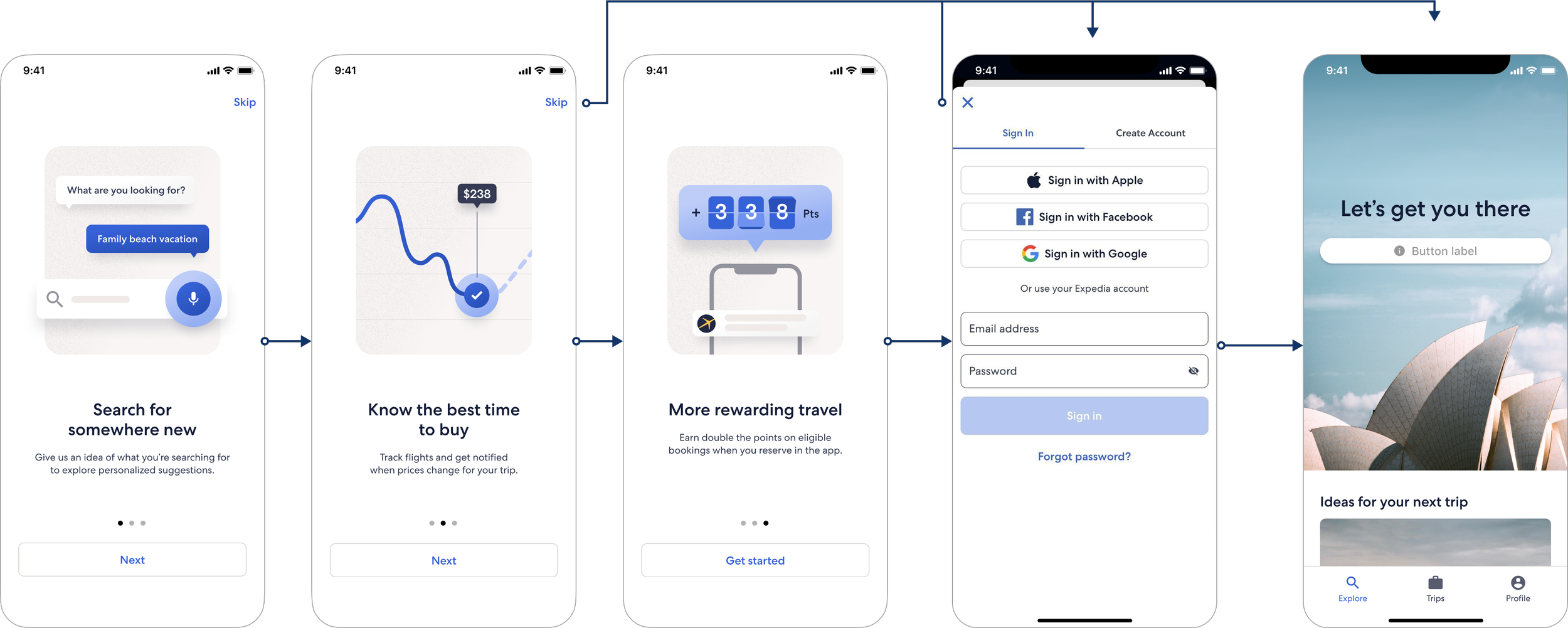
Sequencing Onboarding
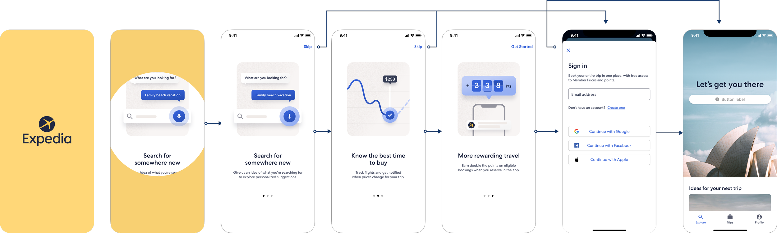
A progressive flow and clearer pagination increased engagement of the full onboarding experience from 13% to 53%
Hypothesis
By moving the product feature promotion screens after the login page and improving the pagination UI, we will increase content relevance and improve the progression rate.
Learnings
More than 50% of users saw all 3 onboarding screens in both variants.
53% of users saw the 3 screens
Conclusive increase in Authenticated Visits by +1.17%
No impact on CVR.
Conclusive increase in account creation in variant 1
Decisions
Roll-out to BEX (all POS, all OS)
Replicate on Hcom
Support OneKey (New Loyalty Mechanic/Proposition) and One Identity (cross-brand account migration) scenarios with learnings and optimised flow to surface contextualised experiences for their USA & ROW use cases
Variant 1 (Winner) - Split Onboarding
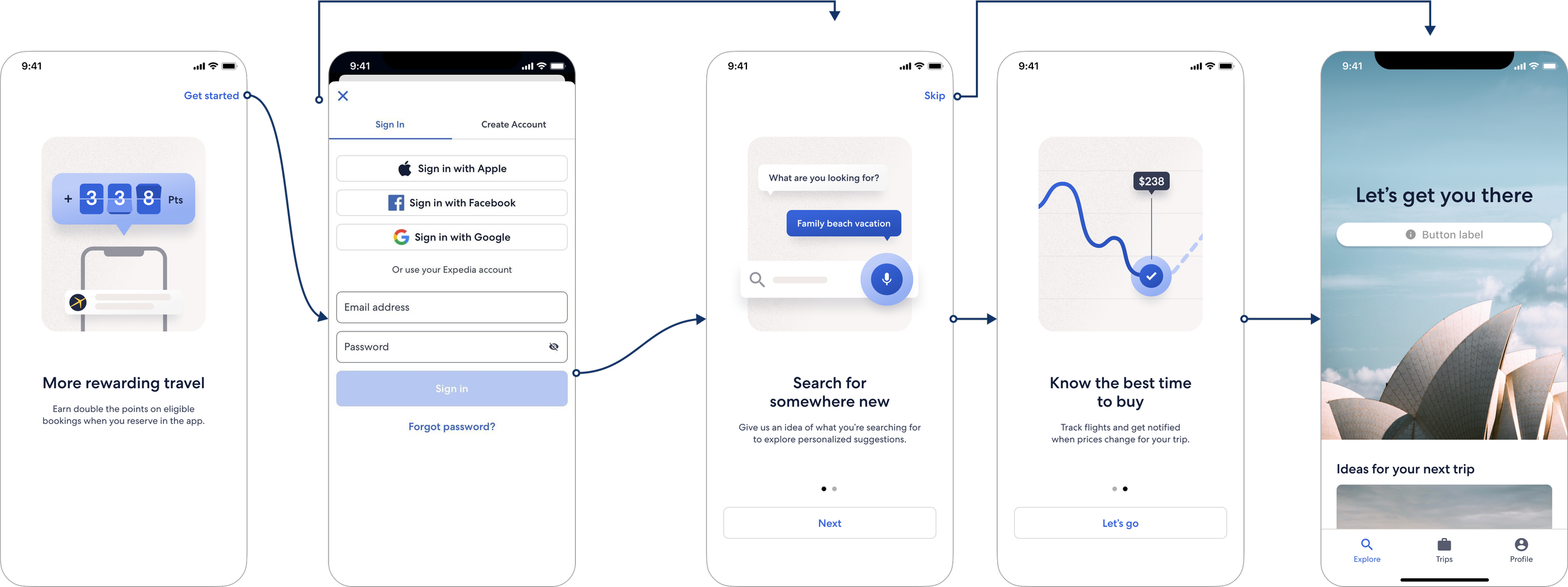
Variant 2 - Front-Loaded Onboarding
Coachmark Refinements
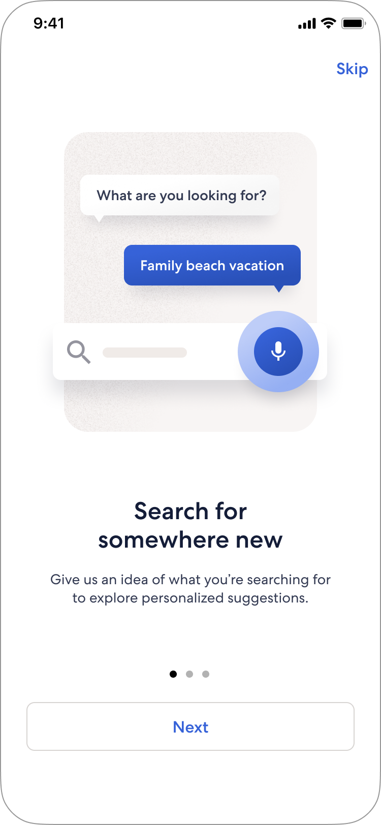
Although we focused primarily on addressing Accessibility (A11Y) issues with the Coachmark, we also took the opportunity to revise and rethink how the Coachmark is used to explain features, while improving its functionality and usability.
Issues with previous experience
Inconsistent visual communication (icon)
Uncommon icon pattern for voice-activated features
(Overall) The copy is vague and lacks instruction
(Overall) The auto-dismiss and no CTA gives no understanding of user intent
(A11Y) The auto-dismiss timing disrupts screen reader reading
(A11Y) How this type of messaging is handled for readers and where the focus should be sent
Research Findings
What we learned from 50 unmoderated sessions:
When seen without a coach mark message, travellers misunderstand the current voice search icon.
Travellers are not familiar with the current icon. Most guess that it refers to adding or saving destinations.
Travellers unanimously understand that a microphone icon means there is the option to tap it and speak.
Travellers respond best to a coach mark message that is simple yet provides enough direction with the use of verbs that show a call to action.
Travellers respond best when they are given clear instructions without being too "wordy."
Including descriptive verbs that communicate a call to action in the header such as "tap" and "tell" give travelers clear direction.
Including an example of what to say in the subtext adds context and improves comprehension.
‘Conversational Search’
in Onboarding Flow
Previous ‘Conversational Search’ Coachmark
and Redesigned Coachmark
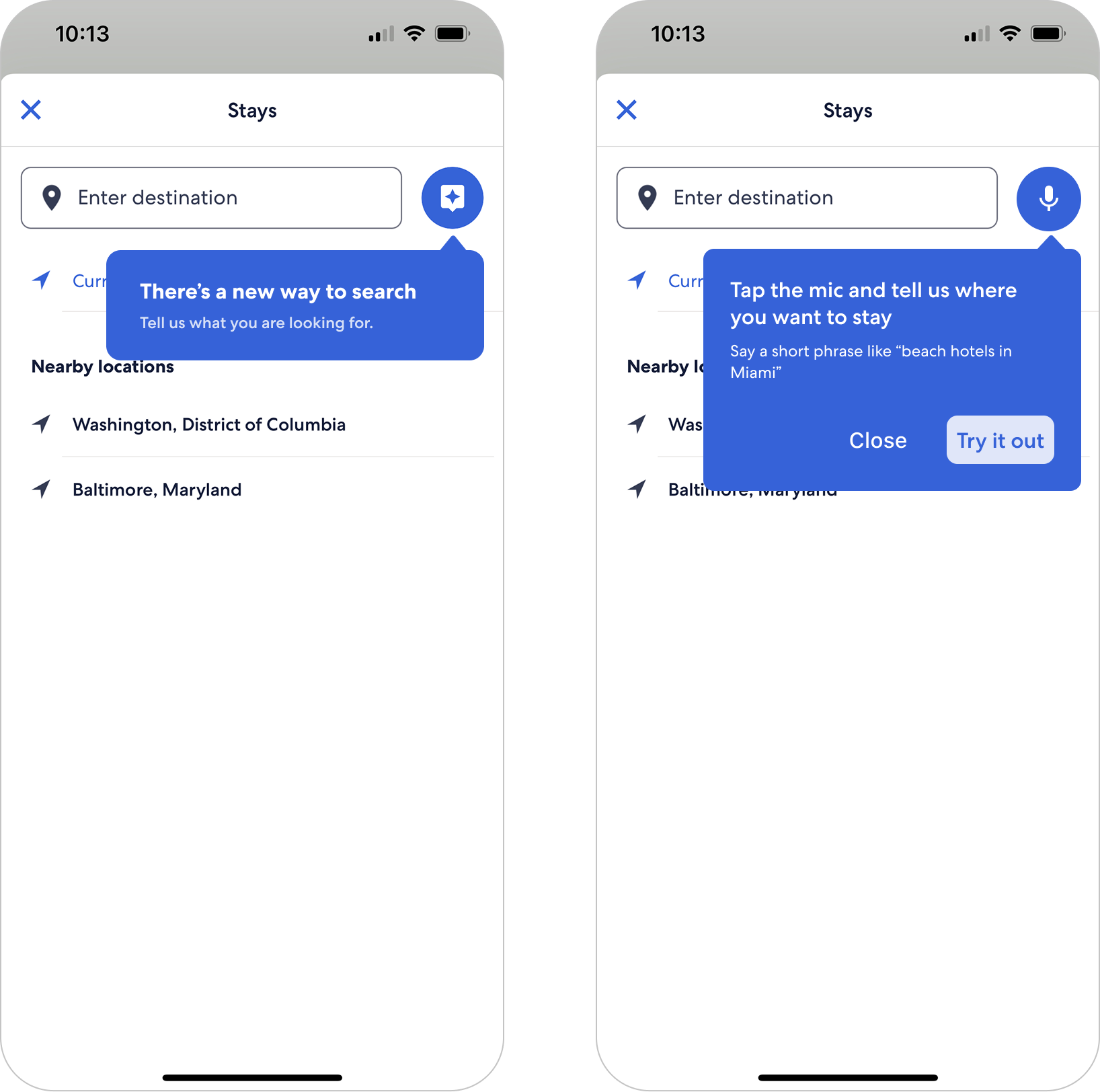
Image Study
How could imagery make onboarding feel more inspiring without getting in the way of explaining what the app actually did? The team considered photography for the global onboarding experience but needed to know whether it communicated the value of Rewards and Price Tracking as clearly as illustration.
How we researched it
Building on baseline studies, we learned that people tended to skim, notice the image and headline first, and wanted onboarding to feel more exciting while making the app’s benefits clear.
The imagery study tested photography against illustration for Rewards and Price Tracking with 250 travellers in France, the UK and Germany. In an unmoderated study, participants first saw the image and headline, then saw the same screen with its supporting copy. That helped us understand what the visual treatment communicated on its own, and what depended on the copy.
What we learned
The illustrations made the feature propositions easier to recognise. In the paired comparisons, 78% preferred the illustration for Price Tracking and 82% for Rewards as the better representation of the benefit.
The proposed photos could feel more welcoming and travel-oriented, but often did not explain the feature. A person looking out of a plane window suggested travel, not price alerts; a family photo suggested togetherness, not points or member prices.
Supporting copy improved understanding of both treatments, but the photography relied more heavily on that copy. Since travellers often skimmed, the image and headline needed to do more of the explanatory work.
The illustrations were clearer, but not perfect: some people found them cold, overly statistical or confusing. Clarity alone was not enough; the treatment also needed to feel engaging.
How it shaped our approach
The research shifted the design question from “photo or illustration?” to “does this image and headline make the benefit clear at a glance, and does the combination feel inviting?”
That gave us practical criteria: choose photography that connects directly to the benefit, make illustrations both clear and engaging, and use the headline and supporting copy to complete the same message. For Rewards, imagery needed to suggest the value of saving and earning; for Price Tracking, it needed to make price changes and alerts understandable. The research informed these criteria; it did not establish one final visual style for every onboarding screen.
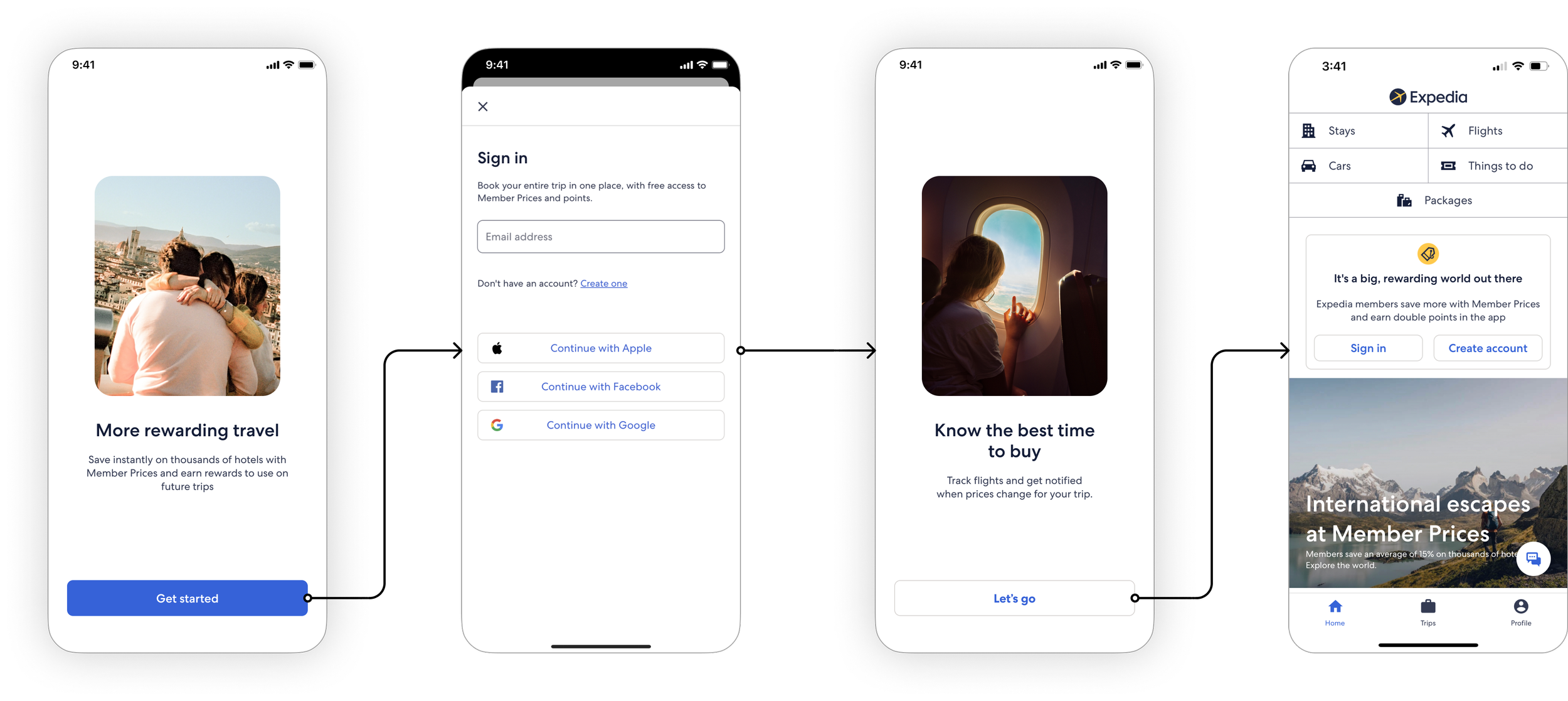
Control
Other Considerations (People, Spaces and Micro-Moments)
Variant
Traveller Onboarding Segmentation
Strategic Shift
Historically, app and web onboarding treated all new arrivals the same way, using generic introductory screens. The new framework shifts the experience:
From: A static onboarding flow primarily targeted at first-time app installs.
To: An intelligent, contextual onboarding system that adapts dynamically based on whether a traveller is anonymous, returning, or dormant.
Outcome
Aligning onboarding with traveller lifecycle stages allows teams to test concrete interventions (such as sign-in prompts, recent search recovery, and loyalty re-engagement) instead of serving a generic welcome sequence. Moving travellers into authenticated, direct sessions reduces reliance on paid reacquisition while improving Identification Rates (IDR), search conversion, and app retention.
Onboarding Segments
Top of Funnel: Cold Start
Historical Data: 0 bookings (5-year lookback)
Paid Channel Mix: ~46% (High acquisition cost)
Primary Surface: Mobile Web (61%)
Auth Rate: ~8% (Unauthenticated CVR is 0.3%, rising to 7.8% when authenticated)
Strategy & Action: Prompt sign-in and sign-up by surfacing member pricing and loyalty rewards; leverage real-time location and device signals to tailor the initial visit.
Mid Funnel: Prospect / New Booker
Historical Data: 2nd+ visit / 0–1 booking
Paid Channel Mix: Moderate
Primary Surface: App & Web
Auth Rate: Variable
Strategy & Action: Resume saved intent (e.g., recent searches), eliminate booking friction, and offer first-booking incentives or attach modules.
Retention & Winback: Lapsed / Churned
Historical Data: Inactive >60 days or 12+ months since last booking
Paid Channel Mix: ~24–38% (Predominantly Direct entry at 51–67%)
Primary Surface: App (55–57%)
Auth Rate: ~66–78%
Strategy & Action: Surface existing loyalty status and OneKeyCash balances, introduce updated app features, and deliver win-back deals to re-establish organic booking habits.
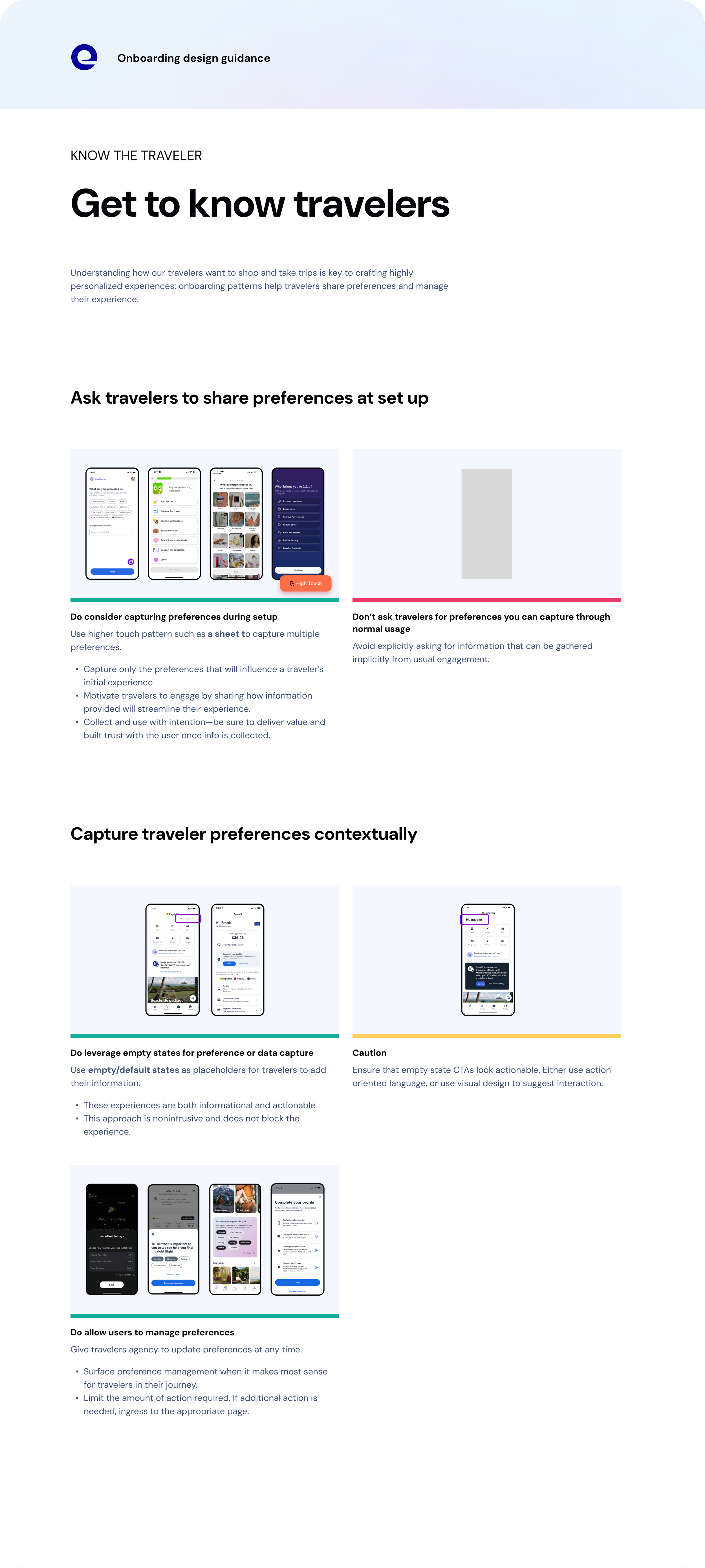
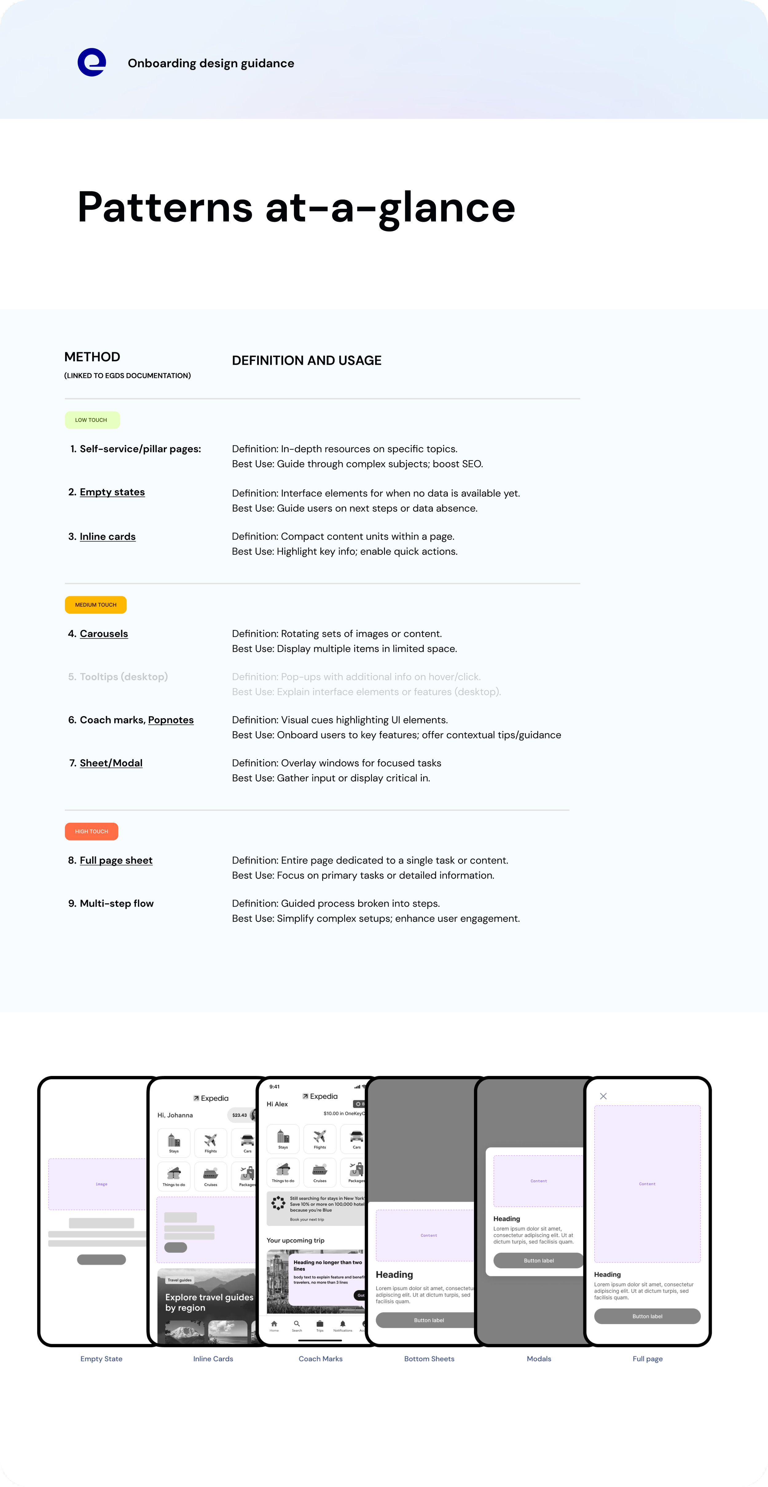
Onboarding framework
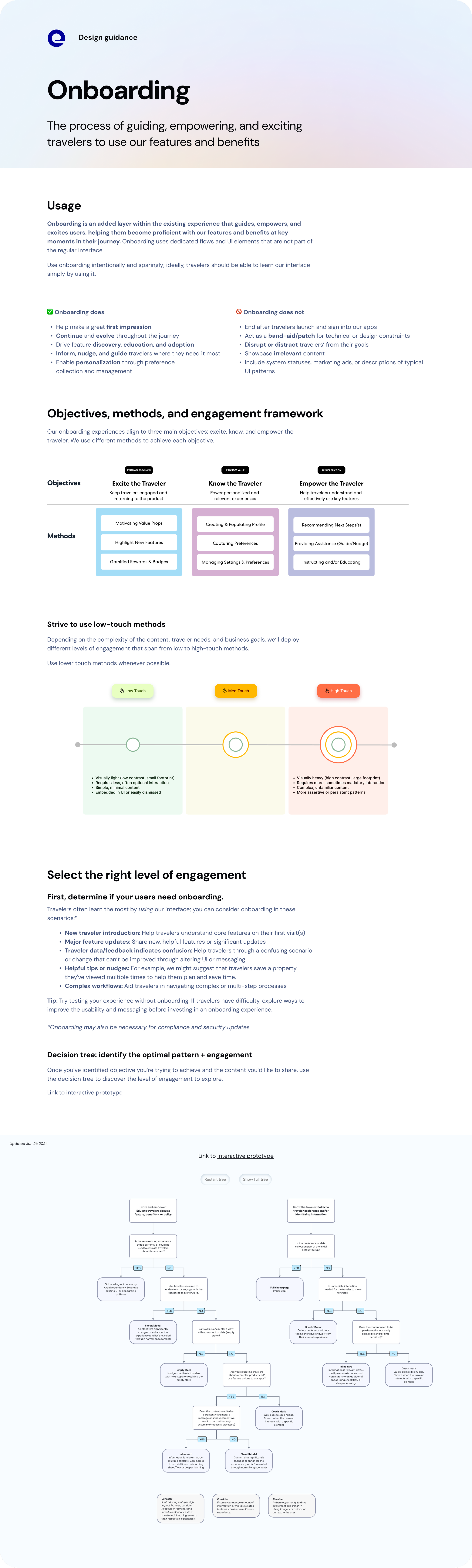
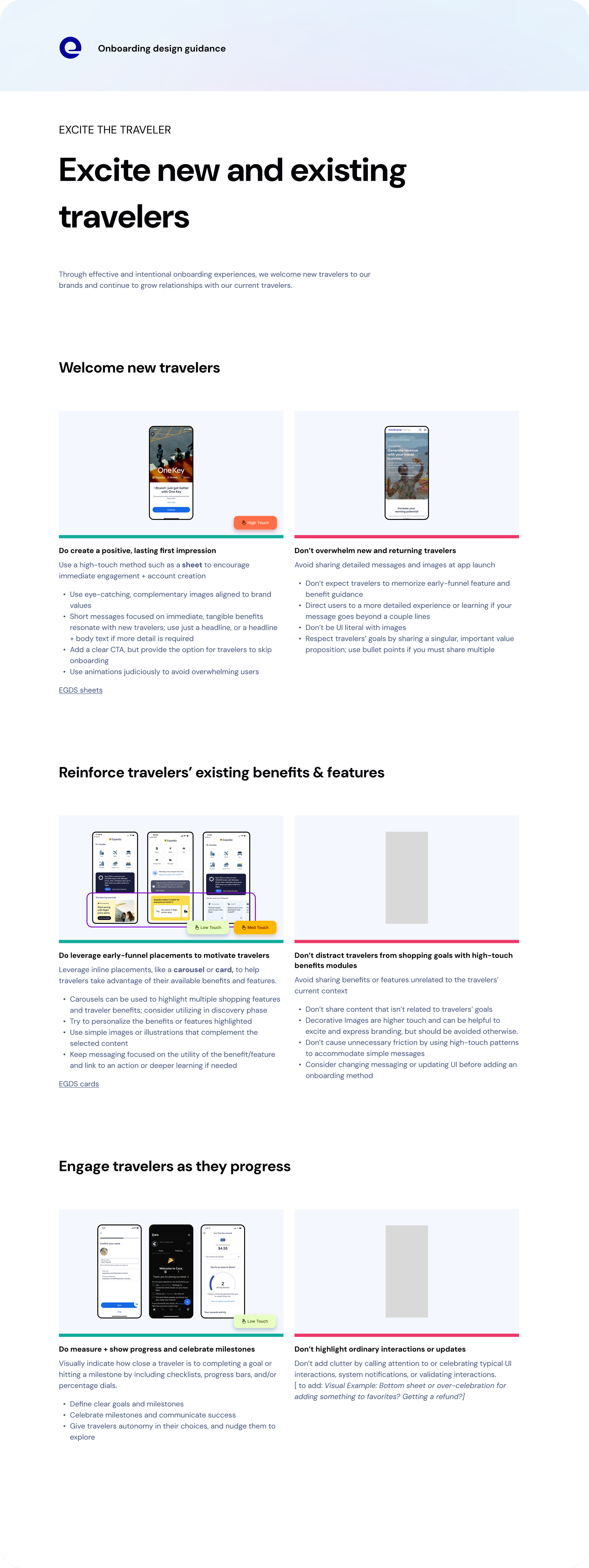
The team consolidated its learning into an Onboarding Framework that served as a source of truth for Design, Product, and Engineering to align, drive decisions, and ensure a standardised traveller experience across the business.
The onboarding framework provided a standardised and strategic approach across the business, ensuring consistency and effectiveness. It enhances the traveler’s journey, raising the design bar and upholding app excellence, while streamlining decision-making to save time, resources, and money.

Summary
Eight months of onboarding
I led design for onboarding for eight months. The team was newly formed, with releases to support and some basic questions still to answer about what we should own. We kept improving the live experience while working out how onboarding could help travellers beyond their first app launch. I worked closely with Product to decide where to focus, using research and test results to guide those decisions. We had to make room for that work alongside incoming requests and release commitments. The strategy developed through this work, and we adjusted it as we learned.
Working through competing priorities
Loyalty, identity, personalisation and marketing all had reasons to use onboarding. Much of my role involved working through those requests with other teams: what did they want a traveller to understand or do, when would it be useful, and could we support it with the people we had? These conversations helped us judge requests against the purpose of onboarding and the needs of the traveller. I also worked with Product to plan design capacity and gave partner teams a place to discuss ideas with us before they became delivery commitments.
Where I left the work
When I moved to Homepage, there was still work underway across brands, markets and One Key. I handed over the priorities and next steps and supported the transition. The team had research and test findings to work from, agreed principles for the experience, and a plan for what to tackle next. Looking back, the most useful part of my time was helping the team get to that point while continuing to ship. We had moved beyond responding to each release or request separately and could explain what belonged in onboarding, why it mattered and what should happen next.



Testimonials
Working with Carl on Traveller Onboarding experiences at Expedia.