Clubcard Online Optimisation
Overview
Our product team were tasked with improving engagement with partner offerings on the Clubcard Website.
As design lead, I partnered with the Product Manager and UX Researcher to understand customer activity and perception of the experience.
I improved the experience with new features focused on customer problems around awareness and proposition complexity (e.g. Surface Clubcard Value, Relevant Content/Rewards, Simplified mechanics).
This resulted in significant increases in Product/Content Discovery and Conversion.
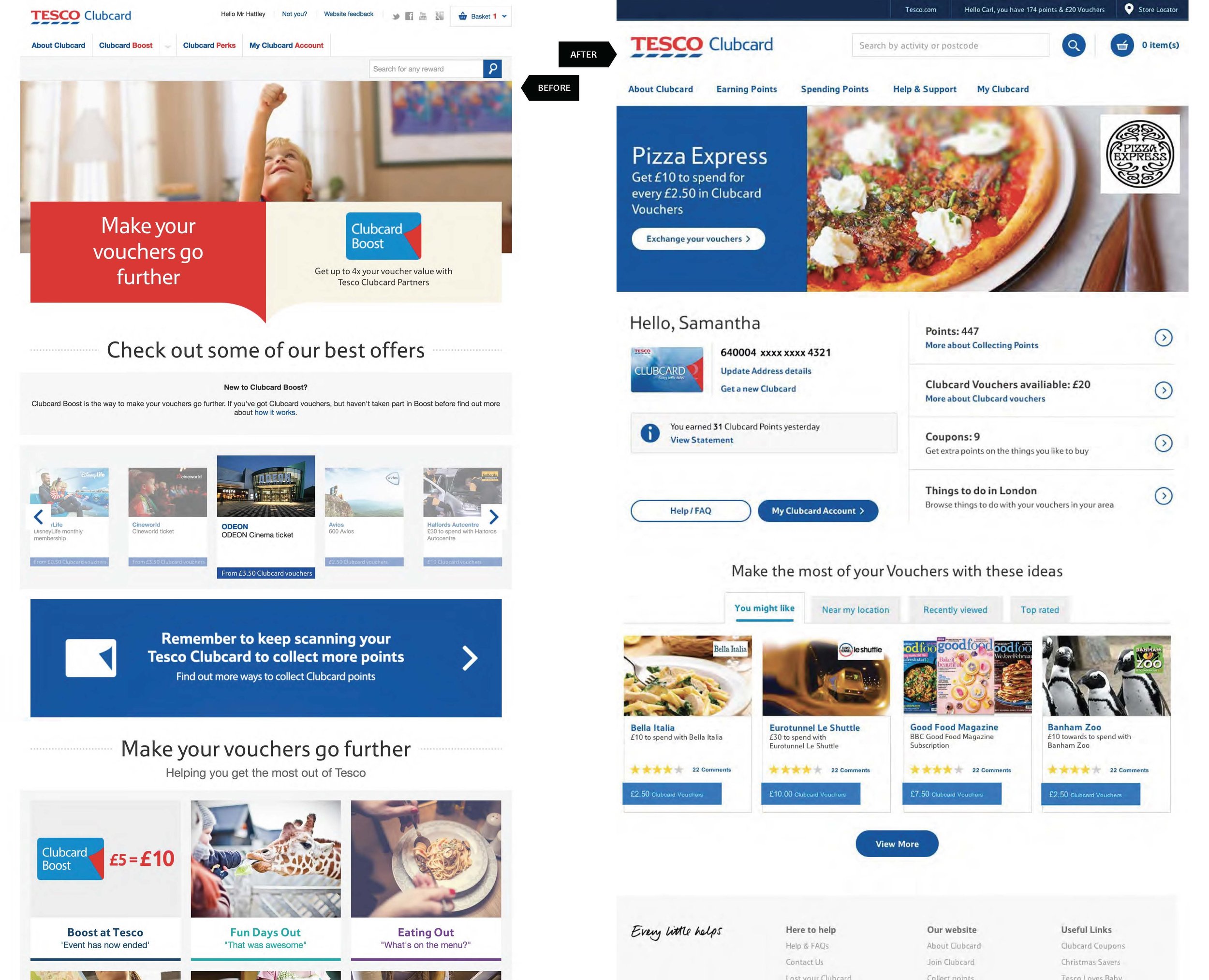
Clubcard Landing Page Optimisation
Increase Awareness & Relevancy
44% were aware of ‘Boost’. An additional 34% reported awareness after we explained it.
Customers don't know what they can do in their area.
Most detractors felt that ‘Boost’ wasn’t relevant. Until probed...
Simplify the Mechanics
Customers often can’t find something that matches their voucher value.
1 in 5 are unable to identify a coupon/voucher correctly
Action:
Work to improve awareness, relevancy and simplify the experience by introducing features that:
Surface and simplify Clubcard value
Highlight Relevant Content & Rewards
A/B Test Results:
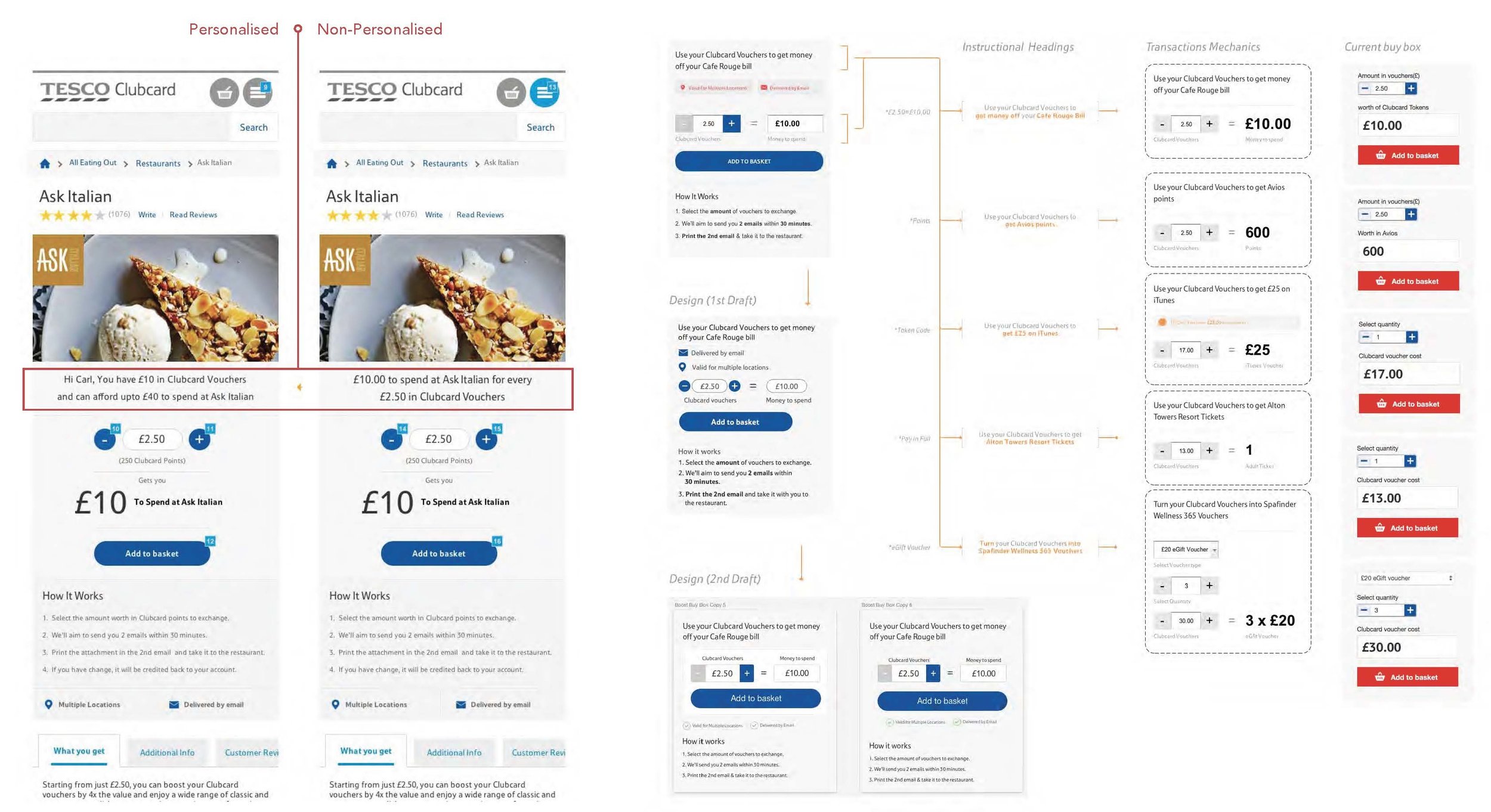
Personalised content will increase orders by providing a more relevant experience.
Conversion: 6.7% increase
CTR: Up to 40% uplift, dependent on item
Surfacing customer value will increase orders by prompting customers to spend their vouchers.
39% decrease in traffic to the Account section
32% increase in basket start rate for those with vouchers
64% increase in checkout completion (with vouchers)
Customers with vouchers saw almost 4x more product pages than those without.
Strong increase in customers with no voucher value by clicking on the collect info module (was 6%, now 12%).
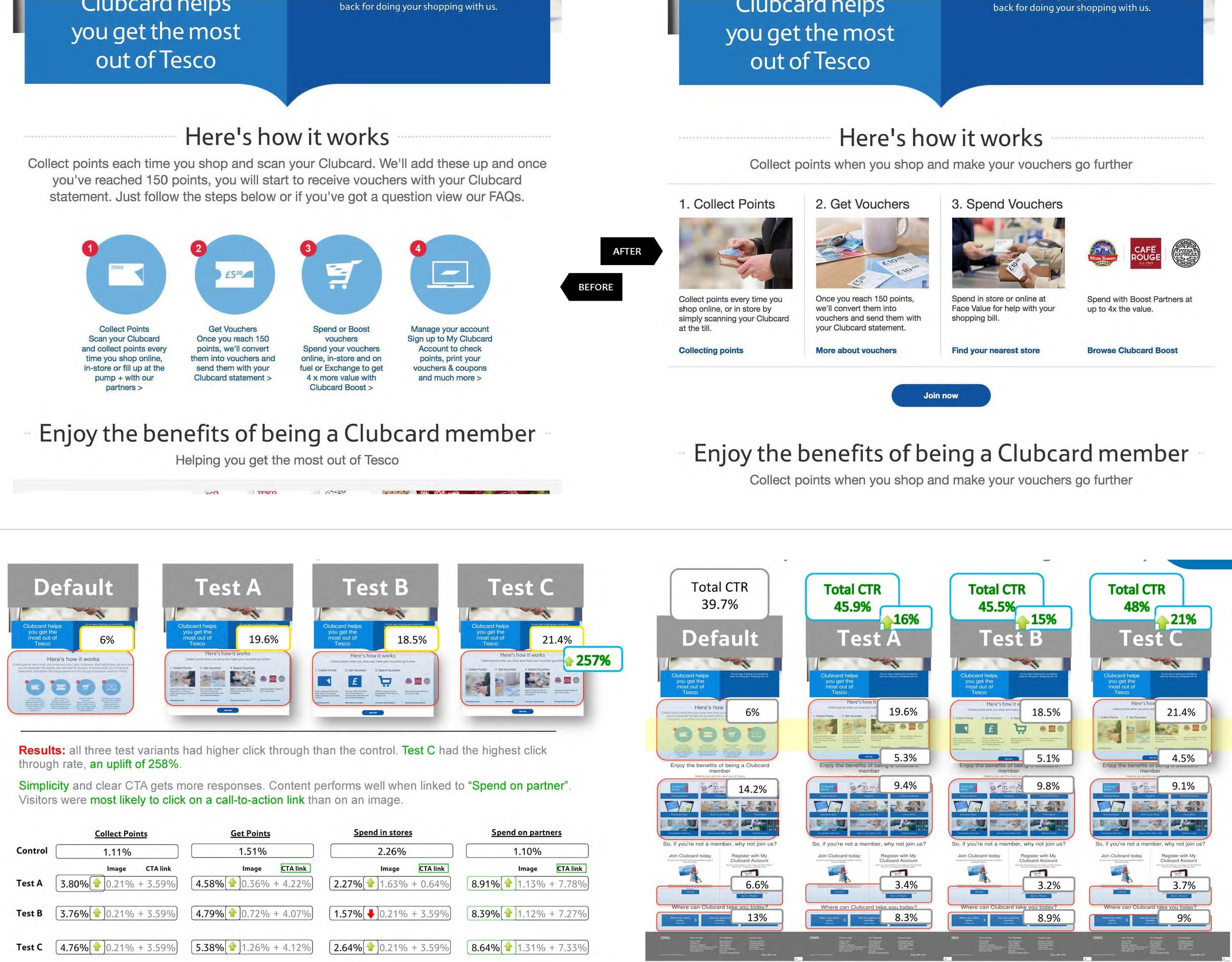
Clubcard ‘How it works page’ Optimisation
Insights:
There's a disconnect between when points are collected and when value is issued.
Just 43% understand that they only receive vouchers every 3 months.
The value of rewards and the transaction/fulfilment process aren't clear and don't align with customer expectations.
Points = Vouchers = Token Code/ Discount/ Points/Voucher/ Ticket/ Item... Redeemed via email(s), printer or delivery... Varied expiry dates.
Action:
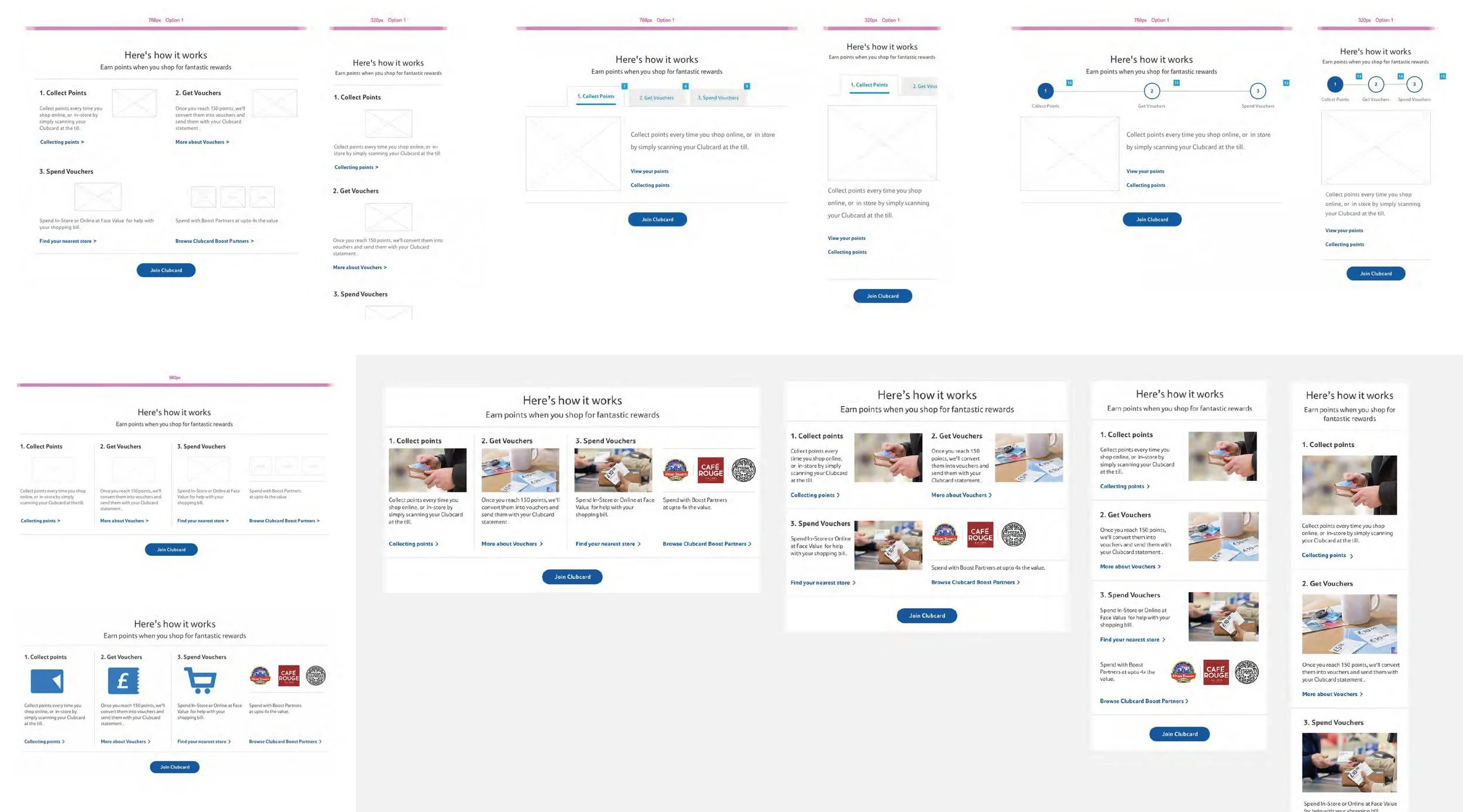
A clean design with prominent, visible calls to action will make it easier for customers to understand.
Apply Text hierarchy to make it more browsable.
Add a join link for those who are now clear and enticed.
Action-oriented headings & CTAs
Experiment with descriptions and icons vs photos
MVT Test Results:
All 3 variants had higher click-through than the control.
Test C had the highest click-through rate, an uplift of
258%. Simplicity and a clear CTA get more responses.
Test C, with the simplest design, produced the highest
click-through rate on the how it works section.
The new designs drove a higher click-through rate on
Clubcard Join on Desktop and Mobile devices.
Visitors were more likely to click on the call-to-action
links than on the images.
Iteration
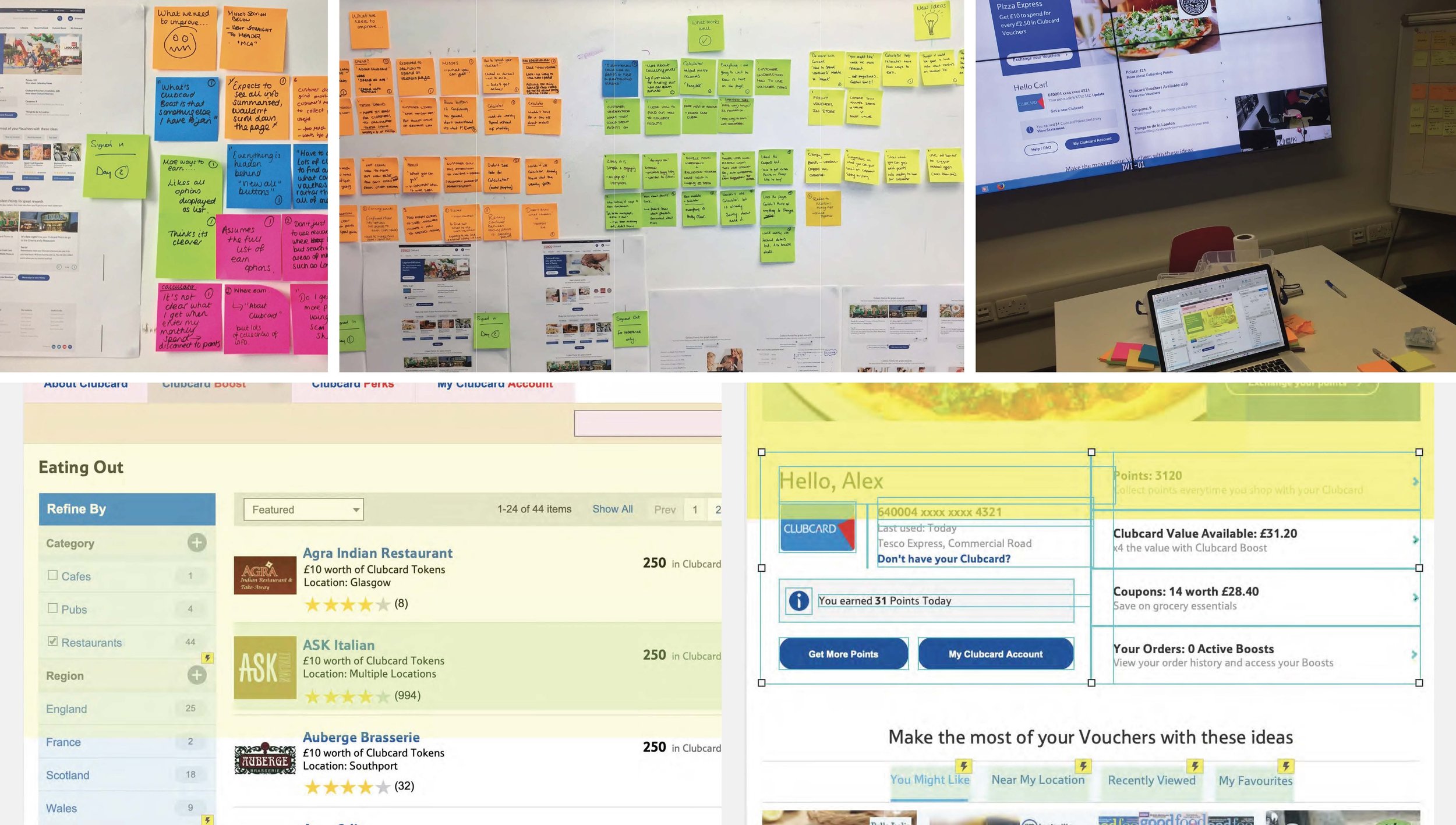
Clubcard Website - Lab Testing with Axure Prototypes
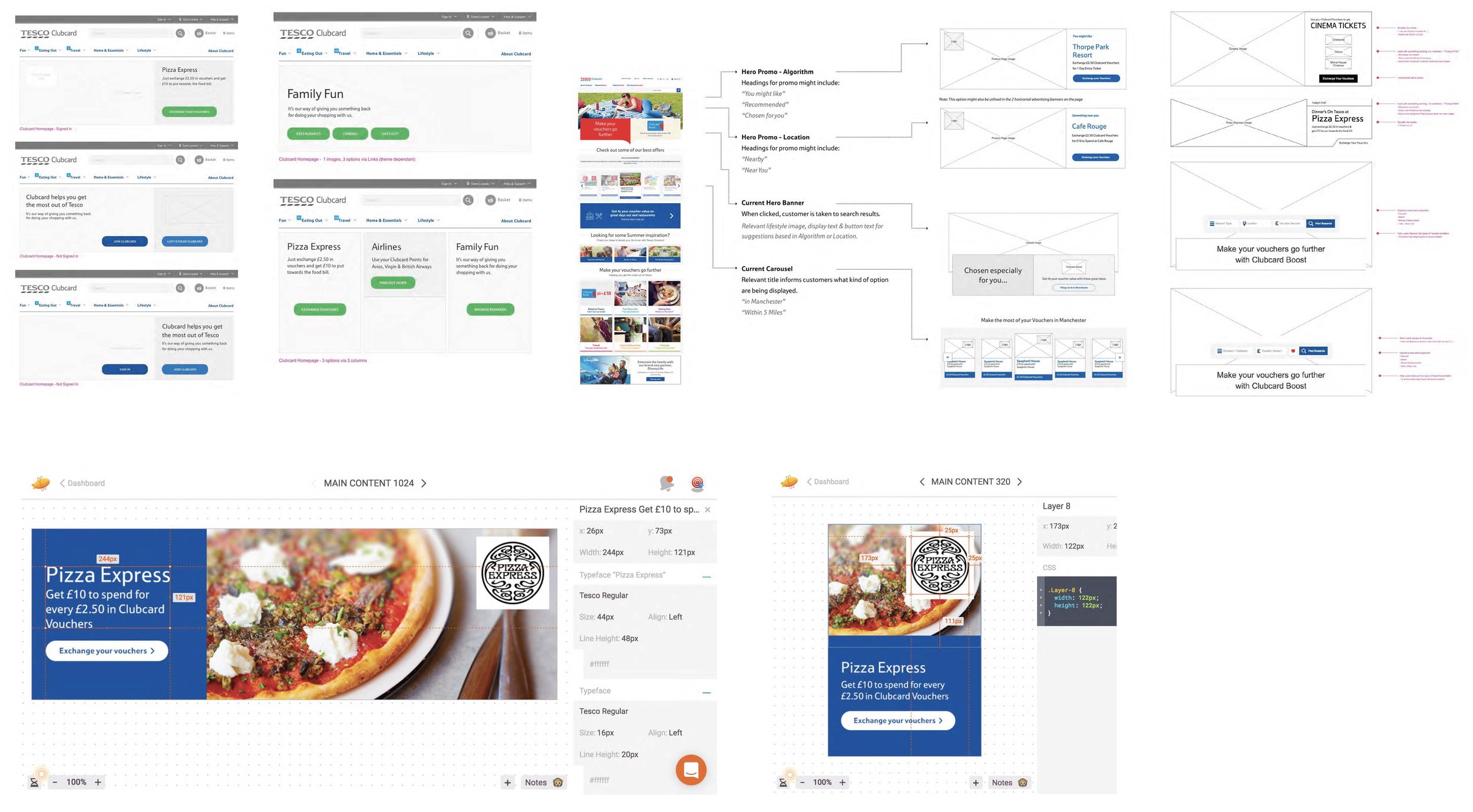
Promo iteration
Ideate & Validate interaction (Selection method)
Explore Functionality (Level of personalisation)
Refine Design & Layout (Relevance - Location, Price, Activity)
Clubcard Product Details Page Optimisation
Overview
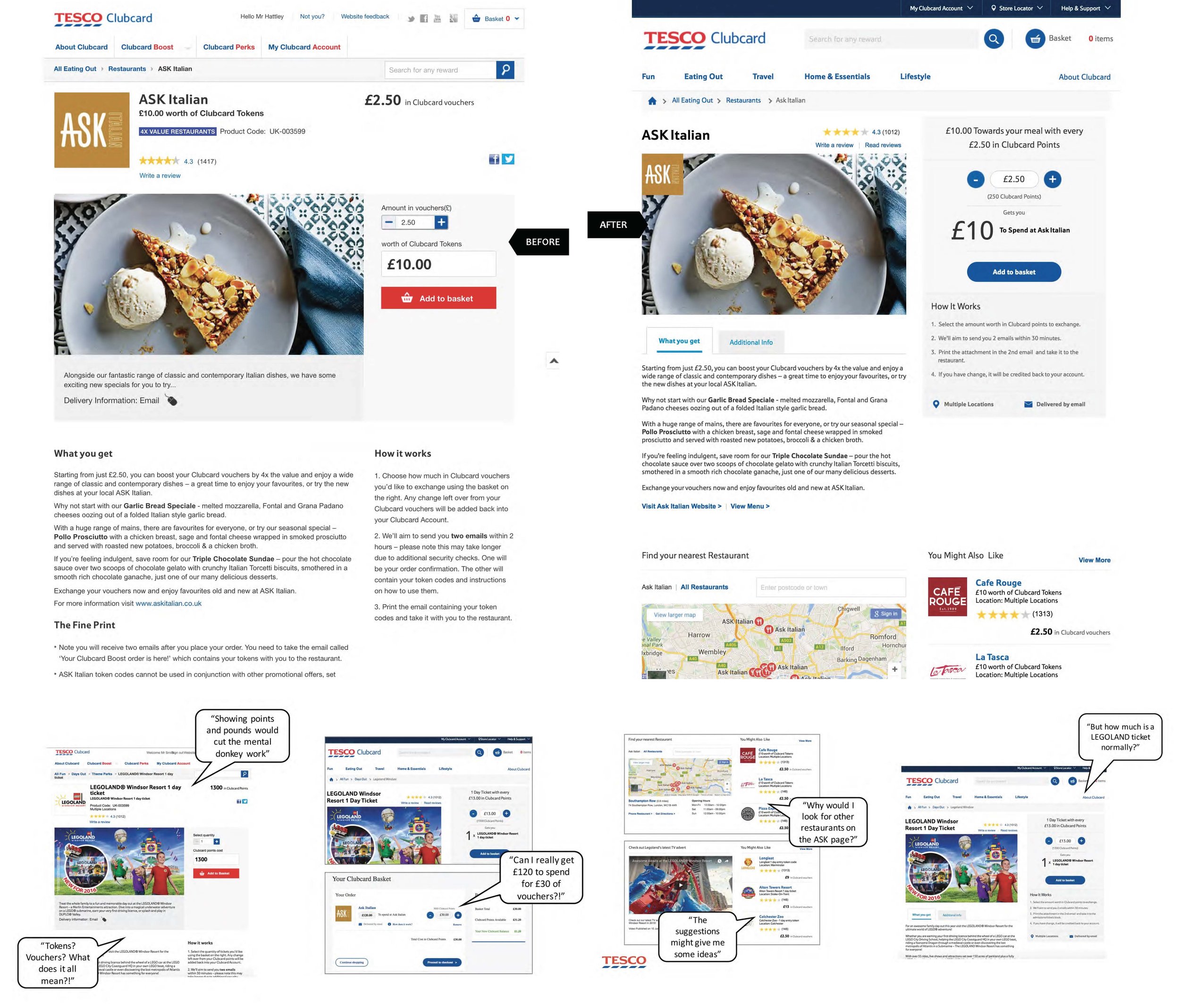
Customers find the current experience confusing and complicated. The reward value, as well as the transaction and fulfilment process, isn't clear and doesn't align with their expectations.
Simplify the experience with a clearer interface that highlights the reward's value and guides customers through the process.
Customer Reactions to current design
Clubcard voucher cost was confusing. ‘Cost’ reminded participants of money and made them think they’d be charged.
All numbers on the ASK page confused participants. They didn’t know that £2.50 related to Clubcard vouchers.
Many expected to quote the product code to ASK staff. Very few noticed that a different code would be emailed to them.
Customer Reactions to new design
The phrase ‘Gets you’ helped participants understand how the exchange worked. The more prominent ‘How it works’ did too.
Participants understood and were very impressed with the value of the ASK deal but didn’t know whether Legoland was as good.
Many questioned why they would need to print anything when their phone would be preferred, followed by post.
Including both points and pounds was clearer than one currency alone.
Iteration
Clubcard ‘Navigation’ Optimisation
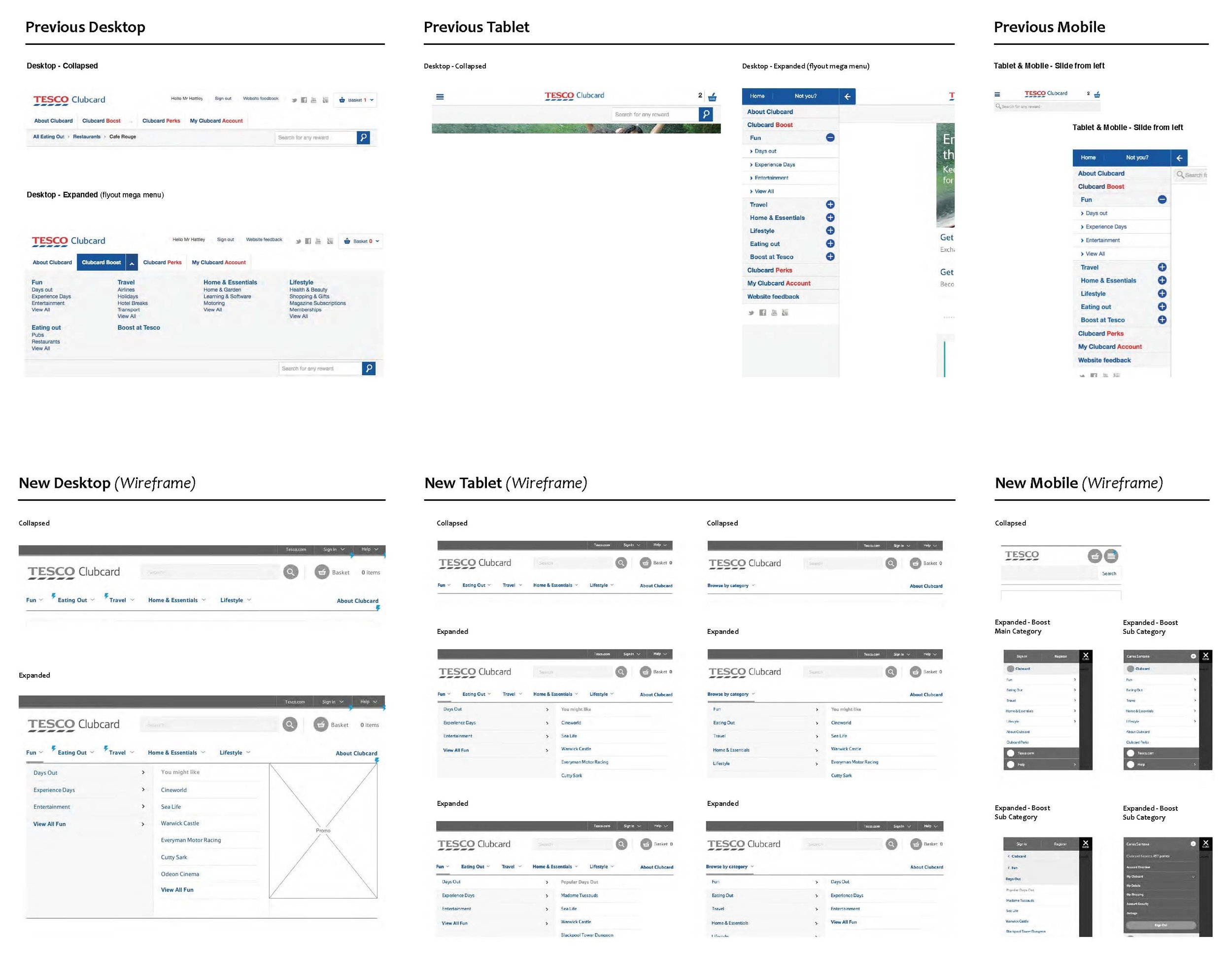
Reactions to current navigation
From lab-based usability sessions, we learned:
Participants used search most often. Useful for something specific. Not if browsing and unaware of the range (most customers are).
Search was also preferred for more general categories, ‘restaurants’ or ‘restaurants near [town or postcode]’.
Some used search to ask questions. e.g. ‘How does Boost work?’
While some had previously visited the Clubcard homepage, none used it regularly enough to be familiar with it.
Very few used the ‘Clubcard Boost’ navigation to browse because they didn’t understand what it meant.
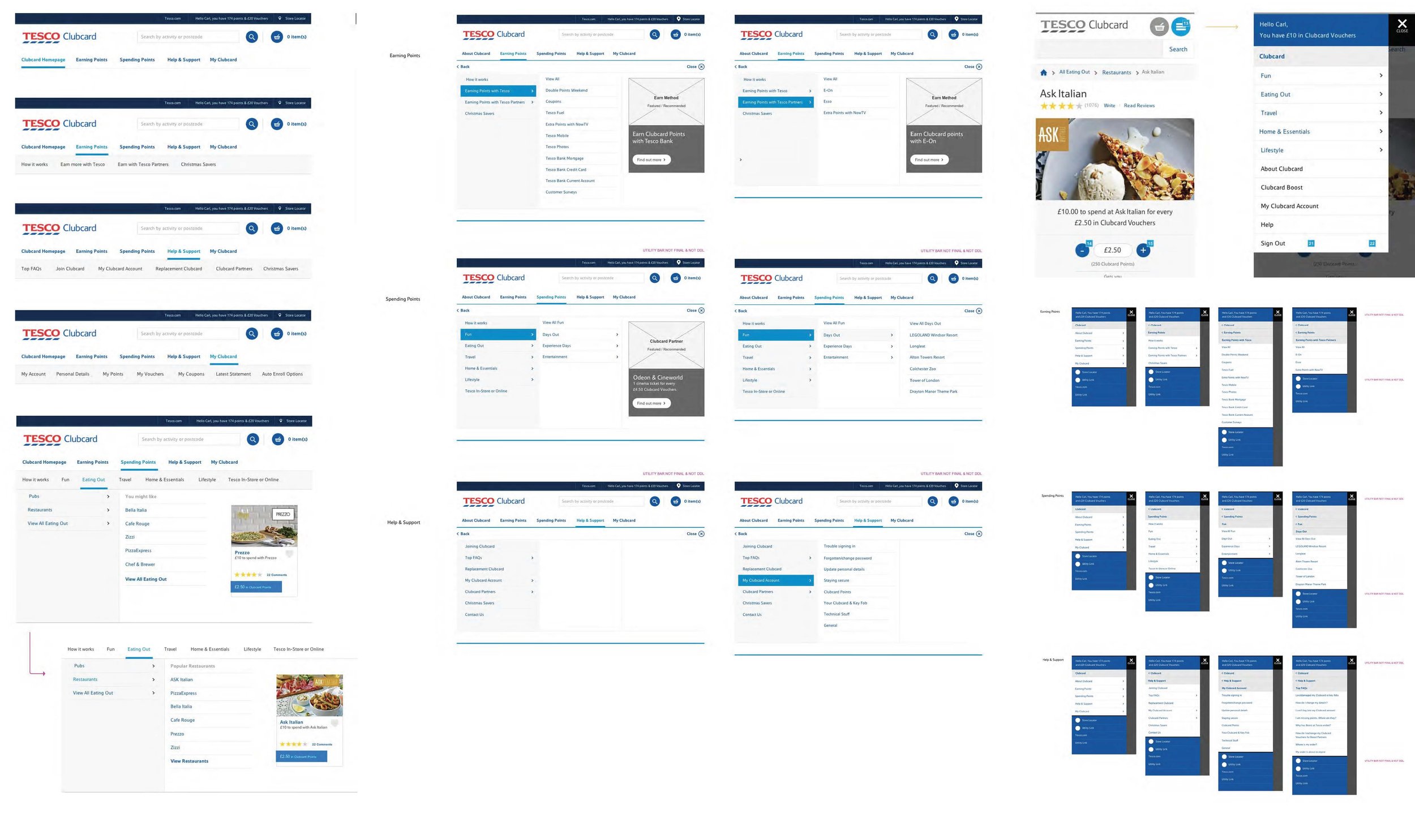
Reactions to new navigation
From lab-based usability sessions, we learned:
Most participants used the navigation first to find specific offers (ASK Italian and Legoland).
The new navigation surfaced other options far more effectively and broadened participants' knowledge of the range.
Participants showed a noticeable difference in using the new navigation to browse, rather than skipping through pages or search results.
Participants reached their destination in fewer clicks and pages.
Surfacing options rather than hiding them under the misunderstood ‘Clubcard Boost’ made them easier to find.
Some current top-level category names don't make sense to customers. For example, ‘Fun’.
Almost everyone wanted to see their Clubcard balance throughout the process and watch it change as products were added.
Iteration
Under the hood
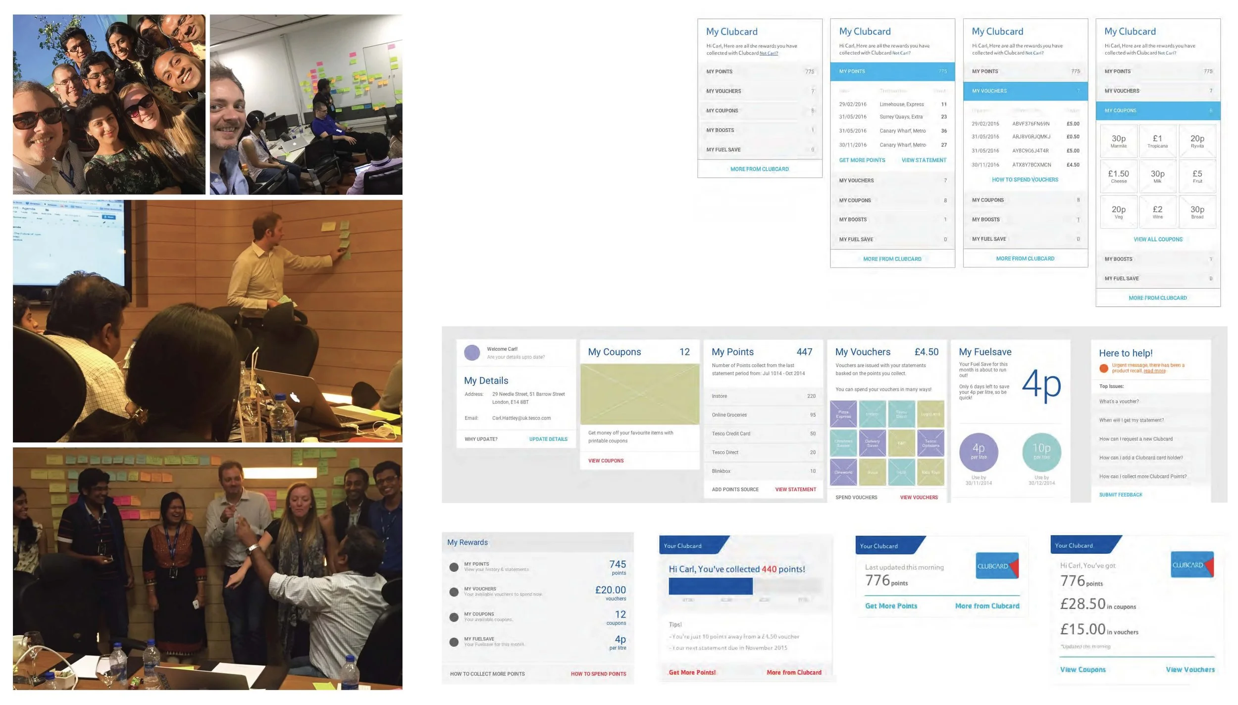
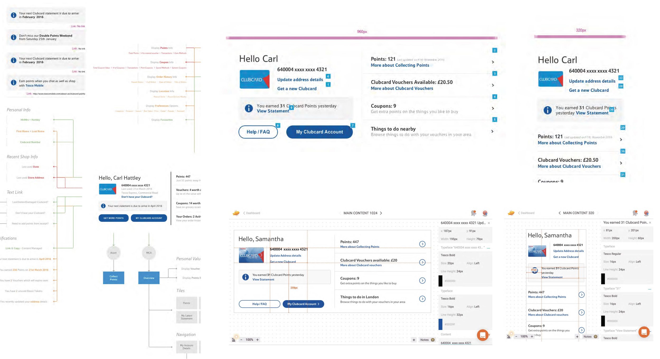
Examples of what was involved
Clubcard Website - Initial Audit
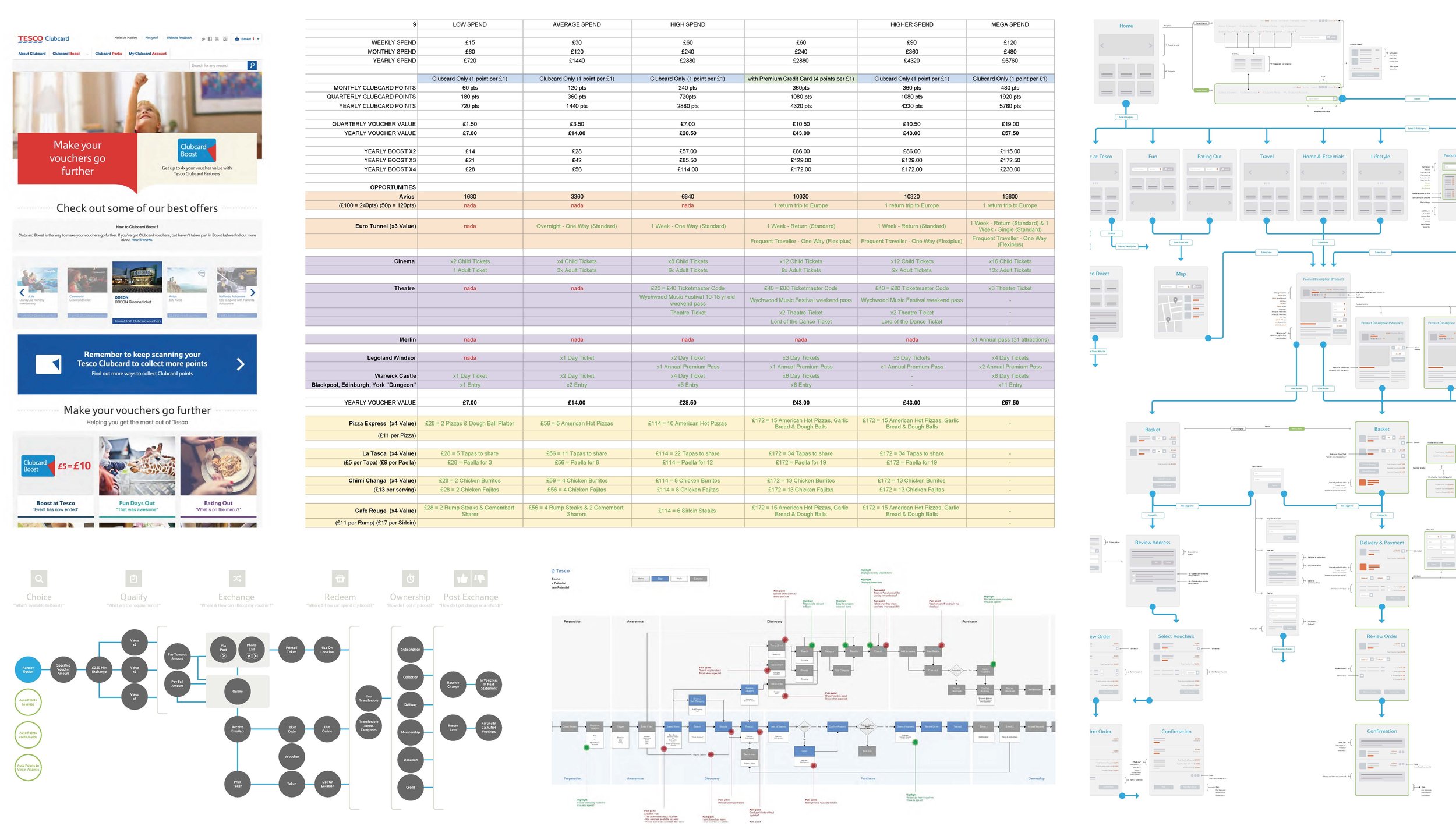
Clubcard Website - Gathering insights
Gathering Insights:
Customer Surveys & In-home interviews
Baseline usability Sessions (Lab & In-home)
Tesco Persona Reviews
Site Analytics Reviews
Stakeholder Interviews
Call Centre Visits
Dunnhumby Insights
Highlights:
Most customers will spend their rewards in-store at face value. Our best rewards are hidden away online.
Customers will receive their vouchers through the post and take them with them when they shop in-store. Many won’t go online to find out about Boost Partners.
Non-Boosters are underwhelmed with the value they receive because they aren't getting the best value for their vouchers.
Boosters have described it as ‘printing money’ and ‘Getting something for nothing’.
Clubcard isn't visible in stores; the experience isn't different to non-Clubcard customers.
Frequent calls for help are self-serviceable.
Most customers don't know rewards are available year-round.
Customers are issued value but then have to navigate the various exchange rates.
Those who use it say it helps them do things they couldn’t normally afford.
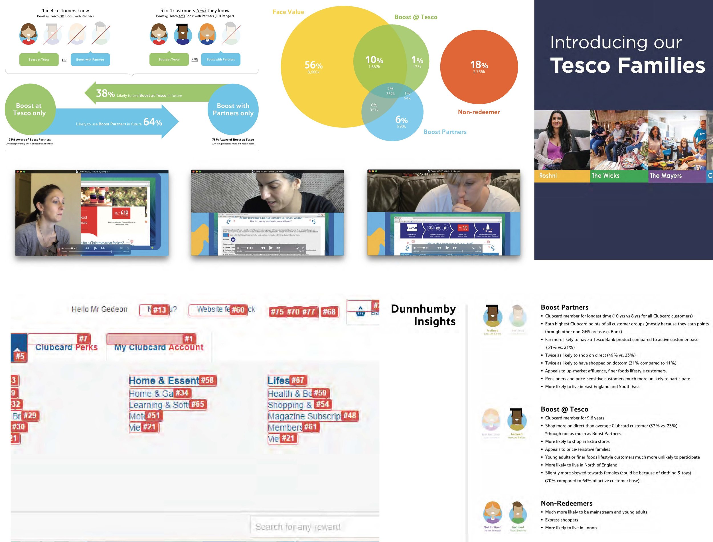
Clubcard Website - Processing insights
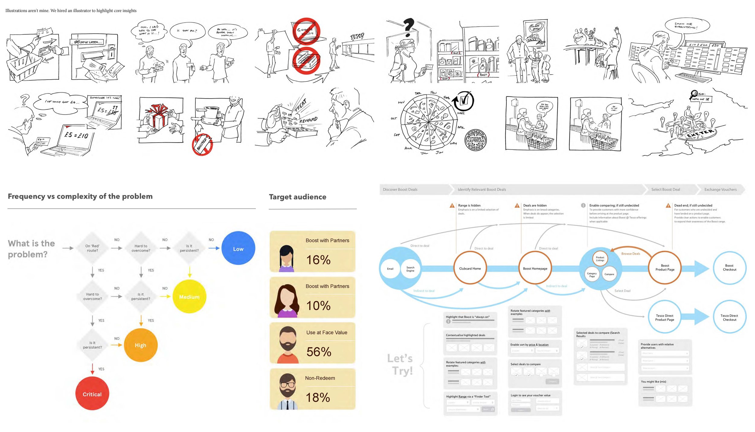
Surfacing Customer Details - Development Spikes
Get under the hood
Technical validation
Understand technical expertise
Sprint planning & refinement etiquette
Stand-ups & retro etiquette
Explore sprint capacity
Explore handover methods
Define definition of done
Speed things up
Surface issues & constraints
Shared sense of progress